Bootstrap Tutorial for Beginners - With Samples
Understand Bootstrap by learning about the tools and basic concepts - With Free Samples.

Hello! This article presents the basic concepts of Bootstrap 5 that might help beginners to start faster with this amazing framework. Upon finishing this article you will know what Bootstrap is and how to code a Landing Page as well as a Dashboard Layout using only HTML and Bootstrap components. Thank You for reading!
Before we start, curious minds can visualize the projects crafted from scratch using only BS5 components.
- 👉 Landing Page - LIVE Demo & sources
- 👉 Dashboard - LIVE Demo & sources
✨ Topics
- 👉 What is
Bootstrap - 👉 How to
install and use Bootstrap - 👉 The most
important concepts of Bootstrap - 👉
Containersand theGrid - 👉
TypographyandColors - 👉
Tables- simple, dark-tables - 👉
ModalsandAlerts - 👉 Bootstrap
CarouselsandNavbars - 👉 Free Samples:
Landing PageandDashboard - 👉
Resources& Next Steps
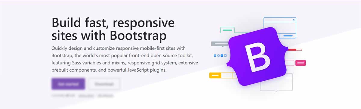
✨ What is Bootstrap
Bootstrap is a popular JS/CSS Framework for developing responsive and mobile-first websites, that provides HTML, CSS, and JavaScript-based design templates for almost anything, including (but not limited to): typography, forms, buttons, navigation, and other components.
Bootstrap focuses on simplifying the development of informative web pages. The primary purpose of adding it to a web project is to apply Bootstrap's choices of color, size, font, and layout to that project. Currently, Bootstrap 5 is the newest version of Bootstrap, with new components, a faster stylesheet, and more responsiveness.
A super important fact about Bootstrap, despite the huge adoption, is the fact that the framework is actively supported and versioned by programming experts and open-source enthusiasts.
✨ Getting Started
In order to start using Bootstrap, a solution is to access the official website and download all provided assets: CSS, and JS files. As an alternative, we can use Bootstrap via a CDN (Content Delivery Network) without any local downloads.
For the CDN set up, add the following code in the head section of your index.html
<link rel="stylesheet" href="https://stackpath.bootstrapcdn.com/bootstrap/5.0.0-alpha1/css/bootstrap.min.css"> After that, add the following two JavaScript files before the end of the <body> tag:
<script src="https://cdn.jsdelivr.net/npm/popper.js@1.16.0/dist/umd/popper.min.js"></script>

<script src="https://stackpath.bootstrapcdn.com/bootstrap/5.0.0-alpha1/js/bootstrap.min.js"></script>
✨ Reasons to use Bootstrap
If you are new to developing and want to create your own stunning, responsive website, then Bootstrap is the right choice. All you need is some basic understanding of HTML, CSS, and JavaScript and you are good to go. There are plenty of templates, themes, and tools that will help you get started building a website. All you need now is to customize the templates if you need a unique look.
👉 Development Speed
Ready-made blocks of code that Bootstrap allows you to use: this can save you a ton of time in development as you don’t have to start everything from scratch. Bootstrap also has ready-made themes and templates that you can choose from. There are plenty of other resources also that provide you with free and premium themes and templates.
👉 Resources and community support
Bootstrap has a lot of resources available on its official website and on many other websites as well. Bootstrap’s website provides full documentation which comes in handy when creating websites. They also provide you with themes and templates that you can use. At the time of writing, Bootstrap’s GitHub page has been used by 3,3M people. it has 21,648 commits and 1,293 contributors.
👉 Responsiveness
All of us would like to browse a website that is compatible with the size of the screen that we are currently using. A website that doesn’t make you zoom in or out just for reading the content. This is where Bootstrap comes in really handy, it’s a responsive design from the start, and with its great grid system and responsive utility classes, creating a responsive website is an easy task.
👉 Customization
An amazing reason to use Bootstrap is the customization side of things. You can use templates so you don’t have to create something out of thin air but if you need a unique and custom look and feel; you can customize everything. To do that, you need to create your own custom CSS file, make changes, include the CSS file in the HTML code of your website and now you have your own customized website.
👉 Consistency
This was the primary reason Bootstrap was developed. Bootstrap makes sure that no matter who is working on a project, the results are the same across every platform.
👉 Open Source
Bootstrap was developed in 2010 on Twitter as a solution to the challenges of the user interface. It was released as open-source in the year 2011. It has been growing ever since to become the most popular front-end development framework.
✨ Bootstrap Important Concepts
Getting started with Bootstrap should be easier if the most important concepts of this amazing framework are well understood.
👉 #1 - Bootstrap 5 Containers
Containers are used to pad the content inside of them. It contains the row elements and the row elements are the containers of columns. There are two container classes available:
Fixed Container
Use the .container class to create a responsive, fixed-width container. Note that its width (max-width) will change on different screen sizes.
Fluid Container
Use the .container-fluid class to create a full-width container that will always span the entire width of the screen (width is always 100%).
Container Padding - By default containers have left and right padding, but to get top and bottom padding, we need to use spacing utilities, to make them look better. For example, .pt-1 means that bootstrap will add small top padding.
Example: <div class="container pt-1"></div>
Container Border and Color - Other items, such as borders and colors, can also be used together with containers:
<div class="container pt-1 border"></div>
<div class="container pt-1 bg-dark text-white"></div>
Responsive Containers - You can also use the .container-sm|md|lg|xl classes to determine when the container should be responsive.
👉 #2 - Bootstrap 5 Grid System
Bootstrap uses a responsive grid system that will re-arrange automatically depending on the screen size. It’s built with flexbox and it allows up to 12 columns across the page. You can group the columns together to create wider columns.
Grid Classes - The Bootstrap 5 grid system has six classes:
.col-(extra small devices - screen width less than 576px).col-sm-(small devices - screen width equal to or greater than 576px).col-md-(medium devices - screen width equal to or greater than 768px).col-lg-(large devices - screen width equal to or greater than 992px).col-xl-(xlarge devices - screen width equal to or greater than 1200px).col-xxl-(xxlarge devices - screen width equal to or greater than 1400px)
TIP: The classes above can be combined to create better layouts AND each class scales up, so if you want to set the same widths for sm and md, you only need to specify sm.
Here are some samples:
Equal Columns Sample
<div class="row">
  <div class="col">column</div>
  <div class="col">column</div>
</div>
Responsive Columns
<div class="row">
  <div class="col-sm-3">column</div>
  <div class="col-sm-3">column</div>
</div>
Two Unequal Responsive Columns
<div class="row">
  <div class="col-sm-4">.col-sm-4</div>
  <div class="col-sm-8">.col-sm-8</div>
</div>
👉 #3 - Bootstrap 5 Typography
Bootstrap 5 has a default font-size of 1rem, and its line-height is 1.5. In addition, all <p> elements have margin-top: 0 and margin-bottom: 1rem.
h1-h6tags
Bootstrap 5 styles HTML headings with a bolder font-weight and a responsive size.
<h1> Bootstrap heading</h1>
<h2> Bootstrap heading</h2>
<h3> Bootstrap heading</h3>
<h4> Bootstrap heading</h4>
<h5> Bootstrap heading</h5>
<h6> Bootstrap heading</h6>
You can also use .h1 - .h6 classes on elements to make them behave as headings.
<p class="h1"> Bootstrap heading</p>
<p class="h2"> Bootstrap heading</p>
<p class="h3"> Bootstrap heading</p>
<p class="h4"> Bootstrap heading</p>
<p class="h5"> Bootstrap heading</p>
<p class="h6"> Bootstrap heading</p>
Display headings are used to make text stand out more than with normal headings.
There are also six classes to choose from and they all have larger font-size and lighter font-weight.
<h1 class="display-1">Display 1</h1>
<h1 class="display-2">Display 2</h1>
<h1 class="display-3">Display 3</h1>
<h1 class="display-4">Display 4</h1>
<h1 class="display-5">Display 5</h1>
<h1 class="display-6">Display 6</h1>
Paragraph elements
<small>/.small- Creates a smaller, secondary text in any heading.<mark>/.mark- Adds a yellow background color and some padding.<abbr>- Adds a dotted border-bottom and a cursor with a question mark on hover.<blockquote>/.blockquote- To quote blocks of content from another source..blockquote-footer- To name a source where the quote is taken.<dl>- Indicates description list creation. It will be followed up by<dt>and<dd>.<dt>- Indicates a description list title.<dd>- Indicates a description list description.<code>- Styles text like it’s displayed in a code editor.<kbd>- Styles text to indicate a keyboard input.<pre>- Used to showcase code in multiple lines.
Paragraph Classes
.lead- Makes a paragraph stand out..text-start- Indicates left-aligned text..text-break- Prevents long text from breaking layout..text-center- Indicates center-aligned text..text-decoration-none- Removes the underline from a link..text-end- Indicates right-aligned text..text-nowrap- Indicates no wrap text..text-lowercase- Indicates lowercase text..text-uppercase- Indicates uppercase text..text-capitalize- Indicates capitalized text.
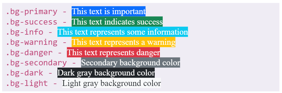
👉 #4 - Bootstrap 5 Colors
Bootstrap 5 has contextual classes to provide meaning through colors. Here are the classes for text colors:
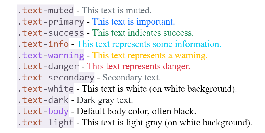
We can also use 50% opacity for black or white text with a suffix added to the above classes:
.text-black-50
.text-white-50
Background Colors
Background colors do not set the text color, so you might want to use them together with .text-* color class in some cases.
👉 #5 - Bootstrap 5 Tables
The most used table styles provided by Bootstrap are presented below.
Basic Table - the .table class adds basic styling to a table:
Striped Rows - .table-striped class adds zebra-stripes to a table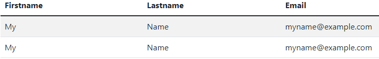
Bordered Table - .table-bordered class adds borders on everything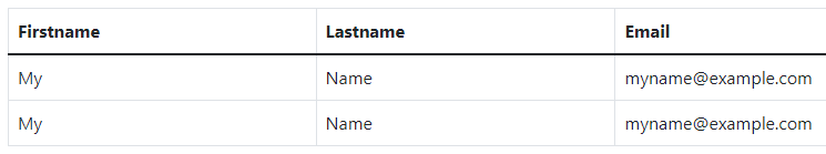
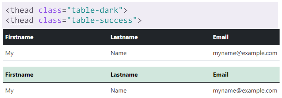
Dark Table - .table-dark class makes the table have a black background
Borderless Table - .table-borderless class removes borders from the table.Contextual Classes - These can be used to color the whole table<table>, rows<tr>or cells<td>.
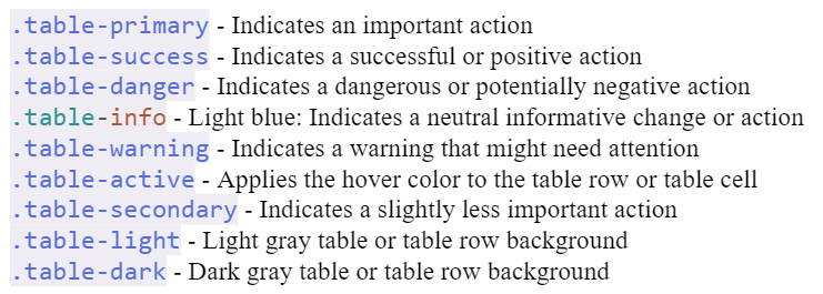
Table Head Colors
Use any contextual classes to only add background color to the table header.
👉 #6 - Bootstrap 5 Modals
The component that is displayed on top of the current page is called a Modal.
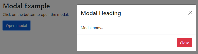
Here is the code for this simple BS5 Modal component:
<!-- Button to Open the Modal -->
<button type="button"
        class="btn btn-primary"
        data-bs-toggle="modal" data-bs-target="#myModal">
  Open modal
</button>

<!-- The Modal -->
<div class="modal" id="myModal">
  <div class="modal-dialog">
    <div class="modal-content">
      <!-- Modal Header -->
      <div class="modal-header">
        <h4 class="modal-title">Modal Heading</h4>
        <button type="button"
                class="btn-close"
                data-bs-dismiss="modal"></button>
      </div>
      <!-- Modal body -->
      <div class="modal-body">
        Modal body..
      </div>
      <!-- Modal footer -->
      <div class="modal-footer">
		<button type="button"
                class="btn btn-danger"
                data-bs-dismiss="modal">Close</button>
      </div>
    </div>
  </div>
</div>
Modal Fading Effect
You can use .fade class to add a fading effect to opening and closing the modal:
<!-- Fading modal -->
<div class="modal fade"></div>
<!-- Modal without animation -->
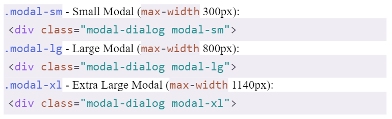
<div class="modal"></div>Modal Size
You can use classes to change the size of the modals. Add it to the <div> element with the class .modal-dialog. Default modal size is 500px max-width.
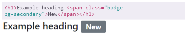
👉 #7 - Badges
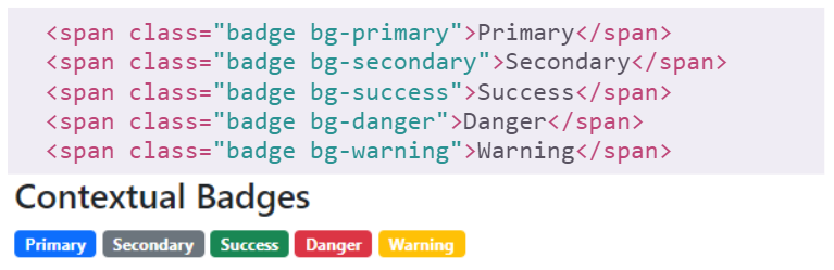
Badges in Bootstrap 5 are used to add some additional info to any content. You can use .badge class together with a contextual class within <span> elements to create rectangular badges.
NOTE: Badges scale to match the size of the parent element (if any).
Contextual Badges - Use these classes (.bg-*) to change the color of a badge
Pill Badges - Use the .rounded-pill class to make badges more round.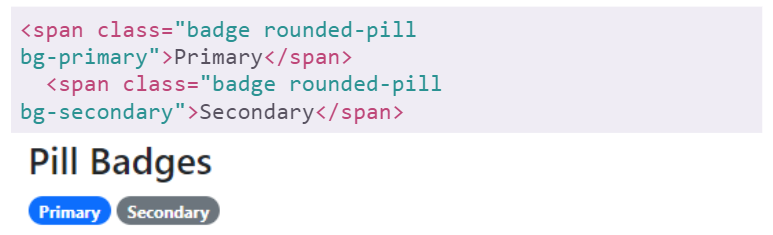
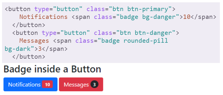
Badge inside an element
You can use badges inside of a button to create more stunning buttons.
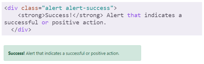
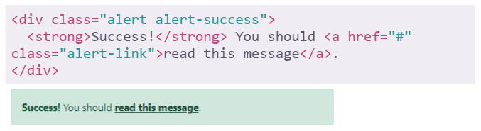
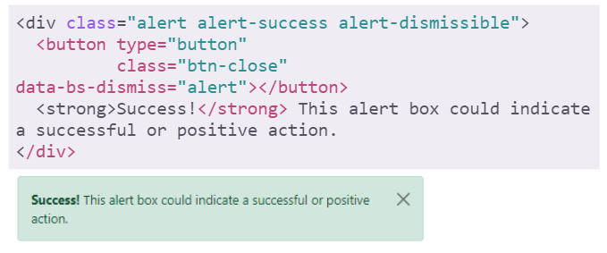
👉 #8 - Bootstrap 5 Alerts
Bootstrap 5 provides an easy way to create alert messages. Alerts are created with the .alert class, followed by a contextual class:
.alert-success, .alert-info, .alert-warning, .alert-danger, .alert-primary, .alert-secondary, .alert-light, .alert-dark.
Alerts Links
Add .alert-link class to any links inside alert boxes to make links match the color of the alert.
Closing Alerts
To close the alert, add .alert-dismissible class to the container. Then add class="btn-close" and data-bs-dismiss="alert" to a link or a button element. (when you click on it, the alert box will disappear).
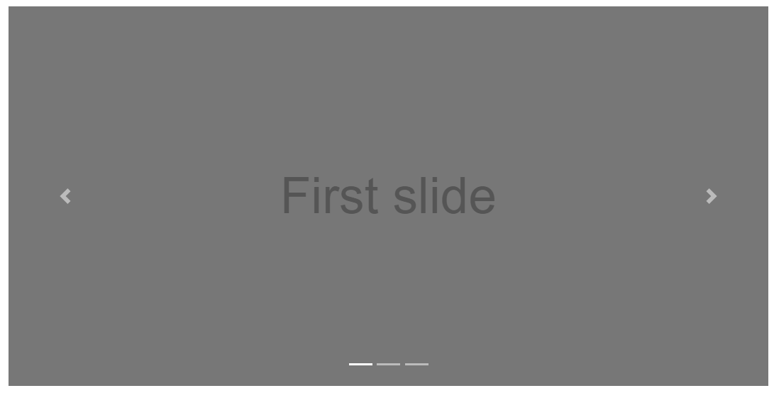
👉 #9 - Bootstrap 5 Carousel
The Carousel is a slideshow for cycling through pictures, etc. Here are the classes used to style the carousel component in Bootstrap:
.carousel- Creates a carousel..carousel-indicators- Adds indicators for the carousel. These are the little dots at the bottom of each slide (which indicates how many slides there are in the carousel, and which slide the user is currently viewing)..carousel-inner- Adds slides to the carousel..carousel-item- Specifies the content of each slide..carousel-control-prev- Adds a left (previous) button to the carousel, which allows the user to go back between the slides..carousel-control-next- Adds a right (next) button to the carousel, which allows the user to go forward between the slides..carousel-control-prev-icon- Used together with .carousel-control-prev to create a "previous" button..carousel-control-next-icon- Used together with .carousel-control-next to create a "next" button..slide - Adds a CSS transition and animation effect when sliding from one item to the next.
👉 #10 - Navbars
A navigation bar is a header that is placed at the top of the page.
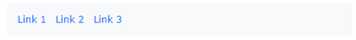
Basic Navbar
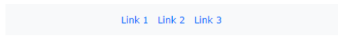
With Bootstrap, navbars are responsive so they can extend or collapse, depending on the screen size. A standard navbar is created with .navbar class, followed by a responsive collapsing class, .navbar-expand-xxl|xl|lg|md|sm which stacks the navbar vertically.
<nav class="navbar navbar-expand-sm bg-light">
  <div class="container-fluid">
    <!-- Links -->
    <ul class="navbar-nav">
      <li class="nav-item">
        <a class="nav-link" href="#">Link 1</a>
      </li>
      <li class="nav-item">
        <a class="nav-link" href="#">Link 2</a>
      </li>
      <li class="nav-item">
        <a class="nav-link" href="#">Link 3</a>
      </li>
    </ul>
  </div>
</nav>
The above code will produce a simple navigation component as shown below:
For those that prefer the links to be centered, .justify-content-center class does the trick:
Colored Navbar
For this use case, we can use any of the .bg-color classes to change the background color of the navbar ( .bg-primary, .bg-success, .bg-info, .bg-warning, .bg-danger, .bg-secondary, .bg-dark and .bg-light).

Collapsible Navbar
To create a collapsible navbar, we need to use navbar-toggler class and specify the data-bs-toggle and data-bs-target properties. Here is the code and the browser output.
<nav class="navbar navbar-expand-sm bg-dark navbar-dark">
  <div class="container-fluid">
    <a class="navbar-brand" href="#">Logo</a>
    <button class="navbar-toggler"
            type="button"
            data-bs-toggle="collapse"
            data-bs-target="#collapsibleNavbar">
      <span class="navbar-toggler-icon"></span>
    </button>
    <div class="collapse navbar-collapse" id="collapsibleNavbar">
      <ul class="navbar-nav">
        <li class="nav-item">
          <a class="nav-link" href="#">Link</a>
        </li>
        <li class="nav-item">
          <a class="nav-link" href="#">Link</a>
        </li>
        <li class="nav-item">
          <a class="nav-link" href="#">Link</a>
        </li>
      </ul>
    </div>
  </div>
</nav>
Fix Navbar (at the top)
The navbar can also be fixed at the top or at the bottom of the page. The fixed navbar stays visible in a fixed position, top or bottom, independent of the page scroll. The .fixed-top class makes the navbar fixed at the top.

✨ Free Bootstrap Samples
This section mentions projects crafted on top of Bootstrap 5 using the concepts presented above that anyone can use for learning programming or just for fun.
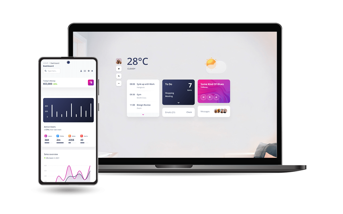
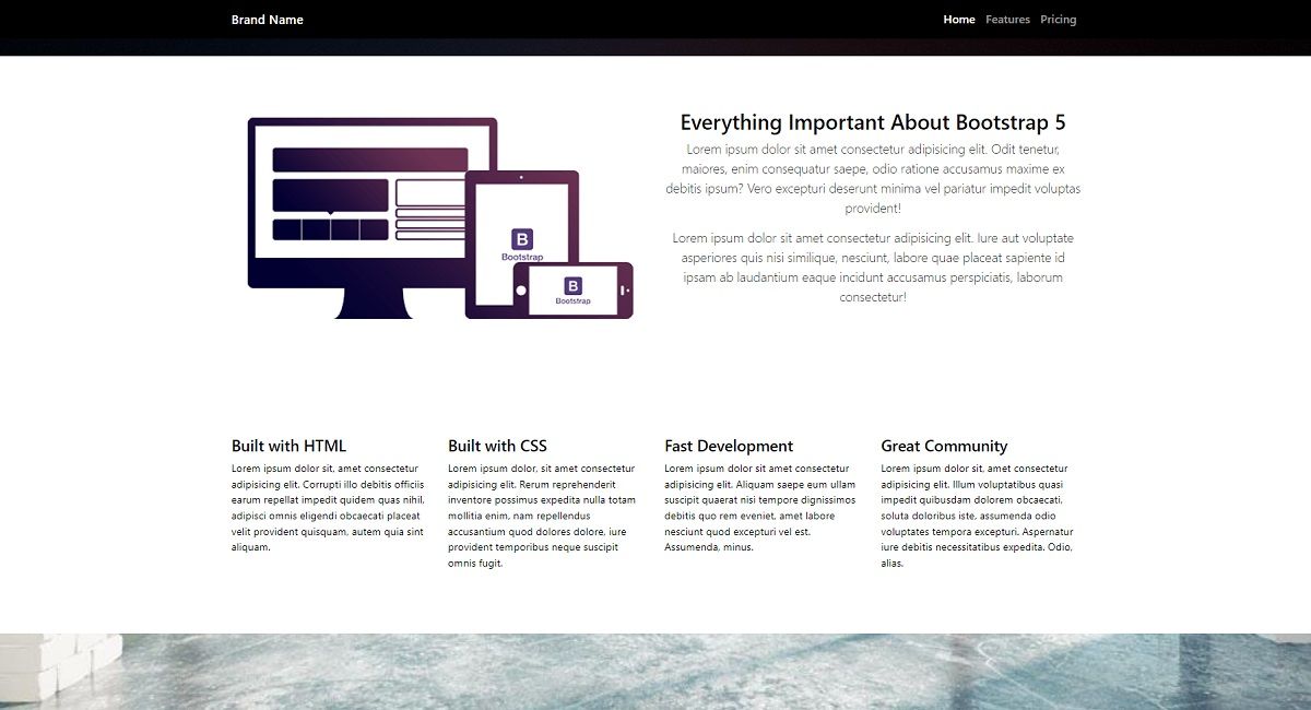
👉 Bootstrap Landing Page
The project is a simple page that uses Bootstrap assets via a CDN and provides the following components: navbar, hero, features, pricing, footer.
- BS5 Landing Page Demo
- Sources - saved on Github
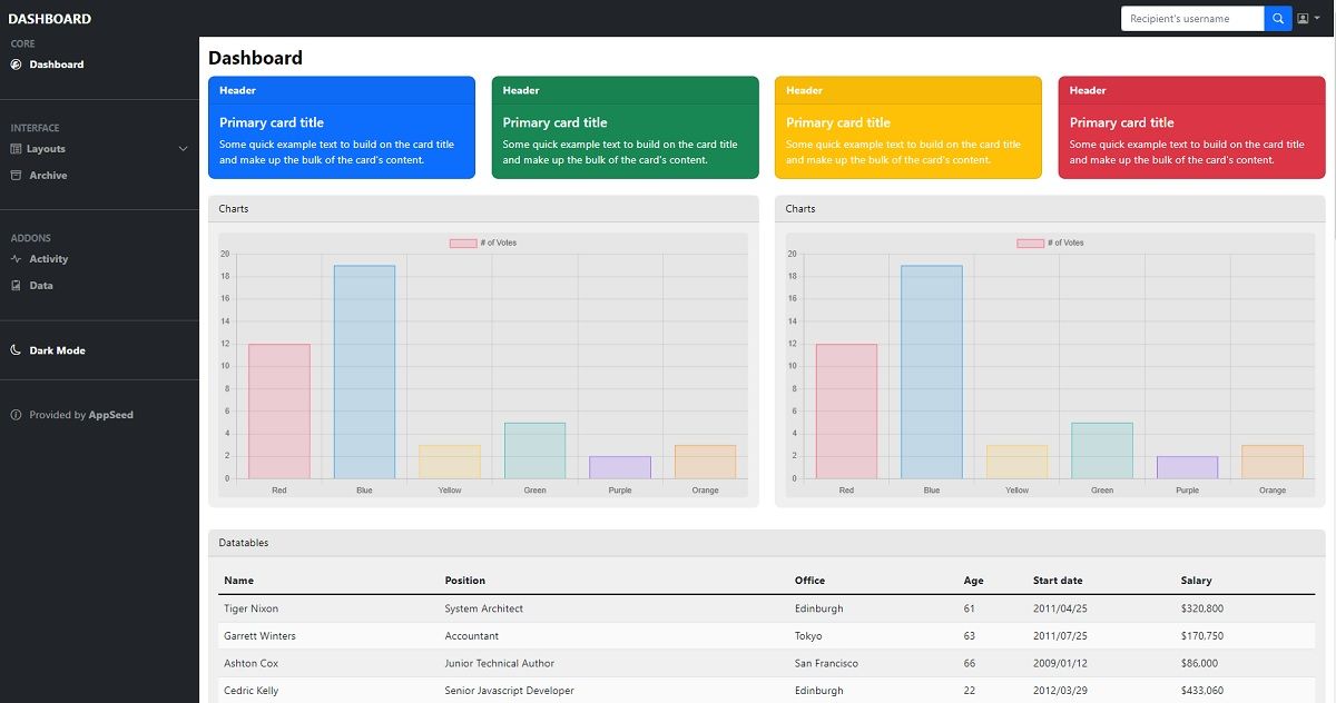
👉 Bootstrap Dashboard
This project provides a different layout with a left sidebar, navigation, containers for charts and tables plus a nice dark-mode.
- BS5 Dashboard - Demo
- BS5 Dashboard - Source Code

The next samples (also free) are crafted by Creative-Tim, a professional web agency and an active player in this amazing open-source ecosystem.
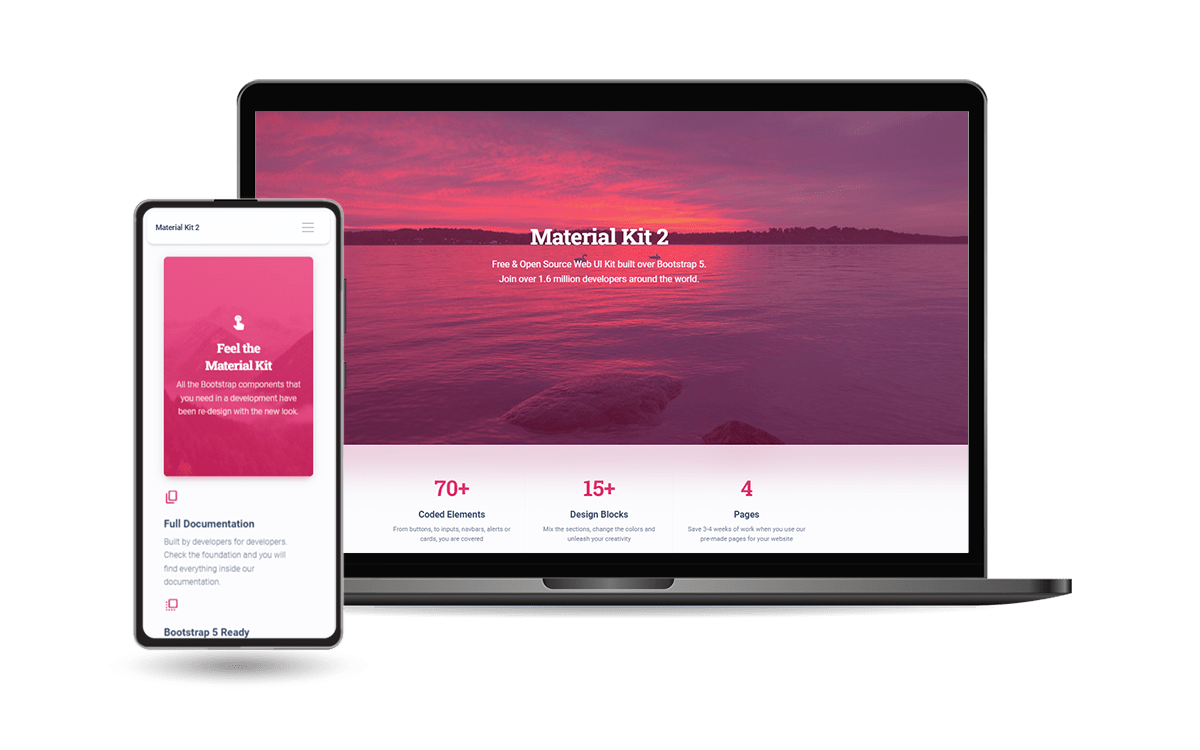
👉 Material Kit 2
Material Kit 2 is built with over 60 frontend individual elements, like buttons, inputs, navbars, nav tabs, cards, or alerts, giving you the freedom of choosing and combining. All components can take variations in color, which you can easily modify using SASS files and classes.
- Material Kit 2 - LIVE Demo
- Material Kit 2 - Product page
This Freebie Bootstrap 5 Design System is coming with prebuilt design blocks, so the development process is seamless, switching from our pages to the real website is very easy to be done.
👉 Soft UI Dashboard
Designed for those who like bold elements and beautiful websites. Made of hundred of elements, designed blocks, and fully coded pages, Soft UI Dashboard is ready to help you create stunning websites and web apps.
- Soft UI Dashboard - LIVE Demo
- Soft UI Dashboard - Product page
If you want to get inspiration or just show something directly to your clients, you can jump-start your development with our pre-built example pages.