Chakra UI React - Coding a Simple Landing Page
How to code a simple landing page in Chakra and React - A comprehensive tutorial.


Hello! This article explains how to use the Chakra UI React Library and code a simple, responsive landing page. The page will be built with Chakra components only, no HTML element will be used. For newcomers, Chakra UI is a library that allows you to build stunning and modern web applications using various layout components. It differs from other UI frameworks in that it offers accessibility and dark mode support by default. Thanks for Reading!
- 👉 Chakra UI Landing Page - Sample LIVE Demo
- 👉 Chakra UI Landing Page - Source Code (all components)
- 🎁 More Chakra UI Templates (all free and open-source)
With Chakra UI, you spend less time building responsive and beautiful websites. If you want to create a web application that allows users to switch between different color modes with minimal lines of code, then Chakra UI is an excellent choice.

✨ Topics
In this article, you will learn about different Chakra UI components and how to use them by building a fully responsive web page with React.js.
With no further ado, let's see an overview of what you'll be learning in this article.
- 👉 5 Key features of
Chakra UI - 👉
How to setup Chakra UIin Create-React-App - 👉
How to style Chakra UIcomponents - 👉 Coding the
Nav component - 👉 Coding the
Hero component - 👉 Coding the
About Us component - 👉 Coding the
Services component - 👉 Coding the
Footer component - 👉 How to enable
Chakra UI Dark Mode - 🎁
Conclusions& Free Resources
✨ Chakra UI, Key Features
The layout components provided by Chakra UI are modern and accessible. Meaning users with disabilities can access your website without any constraints regardless of their disability. With Chakra UI, disability is not a hindrance to having a great user experience.
🚀 Highly customizable
Every web component provided by Chakra UI is highly customizable. You have complete control over their appearance and behavior. Chakra UI allows you to edit and extend the UI components to fit your needs. For example, Chakra UI has only a few icons but allows you to extend the icon library easily.
🚀 Themes and Dark mode support
Manually providing different theme options for users on your website can be a tedious task. But with Chakra UI, you don't have to do much coding because all the components have in-built support for dark mode.
You can also create custom themes or edit the default themes provided by Chakra UI.
🚀 Simple learning curve
Chakra UI has a short learning curve. You don't have to spend much time learning how to use the web components. If you are familiar with CSS or other UI libraries like Tailwind CSS, you will pick up Chakra UI within a few minutes of reading the documentation.
🚀 Excellent documentation
Chakra UI has excellent documentation, easy for new and existing users to navigate and learn about its features rapidly. Chakra UI documentation is developer and user-friendly. With Chakra UI, you are most likely not running into UI-related bugs.
✨ Setting up Chakra UI with CRA
As said earlier, I will guide you through building a fully responsive and modern website using Chakra UI. Before that, let's install the necessary tools needed.
- Open your terminal
- Run the code below to install Chakra UI automatically with create-react-app (CRA).
$ npx create-react-app my-app --template @chakra-uiOtherwise, you can install CRA and Chakra UI manually:
$ npx create-react-app react-chakra
$ npm i @chakra-ui/react @emotion/react@^11 @emotion/styled@^11 framer-motion@^6
Open index.js file in your CRA project and add ChakraProvider:
import React from 'react';
import ReactDOM from 'react-dom/client';
import './index.css';
import App from './App';
import { ChakraProvider } from '@chakra-ui/react';

const root = ReactDOM.createRoot(document.getElementById('root'));
root.render(
  <ChakraProvider>
    <App />
  </ChakraProvider>
);
Open App.js file and copy the following code:
import AboutUs from './components/AboutUs';
import ContactUs from './components/ContactUs';
import Footer from './components/Footer';
import Hero from './components/Hero';
import Nav from './components/Nav';
import Services from './components/Services';
import Testimonials from './components/Testimonials';

function App() {
  return (
    <div>
      <Nav />
      <Hero />
      <AboutUs />
      <Services />
      <Testimonials />
      <ContactUs />
      <Footer />
    </div>
  );
}

export default App
From the code snippet above:
- I created the structure for the web page by dividing it into 7 different components -
Nav,Hero,About Us, etc. - Go ahead and create these components in the
src/componentsfolder.
Once you've successfully set up your CRA project with Chakra UI, let's learn how to style Chakra UI components.
✨ How to style Chakra Components
In contrast to other UI libraries, Chakra UI components are styled by passing CSS attributes as props to web components. This makes it easier to edit the layout of different web components while reducing the number of styles you have to write.
Let's take a look at an example:
import React from 'react';
import { Text, Box, Flex } from '@chakra-ui/react';

const Example = () => {
  return (
    <Box>
      <Flex
        alignItems="center"
        height="100vh"
        bg="red.400"
        justifyContent="space-between"
        p="16"
      >
        <Text fontSize="3xl" color="green.700">
          Hello World
        </Text>
        <Text>Welcome to Chakra UI</Text>
      </Flex>
    </Box>
  );
};

export default Example;
From the code snippet above:
- I imported three components from
Chakra UI. - Text renders text on our web pages. It accepts different props such as
fontSize,color, and other text-related attributes. Chakra UIhas a library of colors that are used in this format -color.opacity. For example, blue.900 means a very dark variant of blue and blue.50 is the lightest. Check the docs for more.Boxis the same as the div tag.Flexrepresents a div tag with a display of flex. It also accepts different props - bg stands forbackground color, andpadding.
We can now start coding each section of the webpage. As we go further in this article, you will learn more about the different components available in Chakra UI.
✨ Coding the Nav Component
This component contains the navigation bar - logo, and menu bar of the webpage.
Let's examine the code below:
import React, { useState } from 'react';
import { Text, Flex, Spacer } from '@chakra-ui/react';

const Nav = () => {
  const [scroll, setScroll] = useState(false);

  const changeScroll = () =>
    document.body.scrollTop > 80 || document.documentElement.scrollTop > 80
      ? setScroll(true)
      : setScroll(false);

  window.addEventListener('scroll', changeScroll);

  return (
    <Flex
      h="10vh"
      alignItems="center"
      p="6"
      boxShadow={scroll ? 'base' : 'none'}
      position="sticky"
      top="0"
      zIndex="sticky"
      w="full"
    >
      <Text fontSize="xl" fontWeight="bold">
        Chakra Sample
      </Text>

      <Spacer />

      <Flex alignItems="center">
        <Text fontSize="md" mr="10">
          About
        </Text>
        <Text fontSize="md">More Apps</Text>
      </Flex>
    </Flex>
  );
};

export default Nav;
From the code snippet above:
- I imported the
Text,Flex, and Spacer components from Chakra UI. - The
Spacer componentcreates space between the flex items, similar to the justify-content: space-between CSS property. - The
changeScroll()function elevates the navigation bar when the user scrolls down the webpage. - The scroll state is used to toggle the
boxShadowproperty when the user scrolls through the webpage.
👉 Creating the Hamburger Menu for smaller screensHere, we will learn about the Drawer component in Chakra UI. The Drawer component is a panel that slides out from the edge of the screen when an action occurs.
Let's examine this code
import {
  Drawer,
  DrawerBody,
  DrawerHeader,
  DrawerOverlay,
  DrawerContent,
  DrawerCloseButton,
} from '@chakra-ui/react';

function DrawerExample() {
  const { isOpen, onOpen, onClose } = useDisclosure();
  const btnRef = React.useRef();

  return (
    <>
      <Button ref={btnRef} colorScheme="blue" onClick={onOpen}>
        Open
      </Button>
      <Drawer
        isOpen={isOpen}
        placement="right"
        onClose={onClose}
        finalFocusRef={btnRef}
      >
        <DrawerOverlay />
        <DrawerContent>
          <DrawerCloseButton />
          <DrawerHeader>Menu Bar</DrawerHeader>

          <DrawerBody>
            <Text>Hello </Text>
          </DrawerBody>
        </DrawerContent>
      </Drawer>
    </>
  );
}
export default DrawerExample;
From the code snippet above:
- I imported the
Drawer,DrawerOverlay,DrawerContent,DrawerBody, Draweris the parent component. It has a child component called DrawerContent containing sub-components such as DrawerHeader, DrawerBody, and DrawerFooter.- These sub-components divide the contents of the
Drawercomponent into three parts. Although, the font size of theDrawerHeadercontents is larger than the others. DrawerOverlaymakes only the Drawer component visible on the page, and theDrawerCloseButtonprovides a close button that closes the Drawer.- When you click the open button, it automatically displays the Drawer. Learn more about the Drawer component here.
Let's build out the DrawerComponent for our web page:
👉 1# - Open App.js and add the following:
import React, { useRef } from 'react';
import { useDisclosure } from '@chakra-ui/react';
...

function App() {
  const { isOpen, onOpen, onClose } = useDisclosure();
  const btnRef = useRef();

  return (
    <Box>
      <Nav ref={btnRef} onOpen={onOpen} />
      ....
      <DrawerComponent isOpen={isOpen} onClose={onClose} btnRef={btnRef} />
    </Box>
  );
}

export default App
From the code snippet above:
useDisclosure()is a custom hook that handles open, close, or toggle actions.- The
btnRefis added as a ref to the hamburger icon totogglethe Drawer open and close.
👉 2# - Open src/Nav.js and add the ref and onOpen props to the hamburger icon
import React, { useState } from 'react';
import {
  Text,
  Flex,
  Spacer,
  IconButton,
  useColorMode,
  useColorModeValue,
  useMediaQuery,
  Icon,
} from '@chakra-ui/react';
import { MoonIcon, SunIcon } from '@chakra-ui/icons';
import { FaAlignJustify } from 'react-icons/fa';

const Nav = ({ onOpen, ref }) => {
  const [scroll, setScroll] = useState(false);
  const { colorMode, toggleColorMode } = useColorMode();
  const navBg = useColorModeValue('white', 'blackAlpha.200');
  const [isLargerThan48] = useMediaQuery('(min-width: 48em)');

  const changeScroll = () =>
    document.body.scrollTop > 80 || document.documentElement.scrollTop > 80
      ? setScroll(true)
      : setScroll(false);

  window.addEventListener('scroll', changeScroll);

  return (
    <Flex
      h="10vh"
      alignItems="center"
      p="6"
      boxShadow={scroll ? 'base' : 'none'}
      position="sticky"
      top="0"
      zIndex="sticky"
      w="full"
      bg={navBg}
    >
      <Text fontSize="xl" fontWeight="bold">
        Chakra Sample
      </Text>

      <Spacer />

      <Flex alignItems="center">
        <IconButton mr="10" w={6} h={6} p={5} onClick={toggleColorMode}>
          {colorMode === 'light' ? <MoonIcon /> : <SunIcon />}
        </IconButton>

        {isLargerThan48 ? (
          <>
            <Text fontSize="md" mr="10">
              About
            </Text>
            <Text fontSize="md">More Apps</Text>
          </>
        ) : (
          // ------ The ref and OnOpen function is added -----
          <IconButton ref={ref} onClick={onOpen}>
            <Icon as={FaAlignJustify} />
          </IconButton>
        )}
      </Flex>
    </Flex>
  );
};

export default Nav
👉 3# - Create the src/DrawerComponent.js. This is where the Drawer contents will be:
import React from 'react';
import {
  Drawer,
  DrawerBody,
  DrawerHeader,
  DrawerOverlay,
  DrawerContent,
  DrawerCloseButton,
  Link,
  Flex,
} from '@chakra-ui/react';

const DrawerComponent = ({ isOpen, onClose, btnRef }) => {
  return (
    <Drawer
      isOpen={isOpen}
      placement="right"
      onClose={onClose}
      finalFocusRef={btnRef}
      zIndex="popover"
    >
      <DrawerOverlay />

      <DrawerContent>
        <DrawerCloseButton />
        <DrawerHeader>Chakra</DrawerHeader>

        <DrawerBody>
          <Flex flexDirection="column">
            <Link mb="5">About</Link>
            <Link>More Apps</Link>
          </Flex>
        </DrawerBody>
      </DrawerContent>
    </Drawer>
  );
};

export default DrawerComponent;
✨ Building the Hero Component
Here, you will learn about the useMediaQuery hook, different breakpoints, and how the screen responds to various screen sizes in Chakra UI.

import {
  Box,
  Button,
  Flex,
  Image,
  Spacer,
  Text,
  useMediaQuery,
} from '@chakra-ui/react';
import React from 'react';
import chakraHero from '../assets/chakraHero.jpg';

const Hero = () => {
  const [isLargerThan62] = useMediaQuery('(min-width: 62em)');

  return (
    <Flex
      alignItems="center"
      w="full"
      px={isLargerThan62 ? '16' : '6'}
      py="16"
      minHeight="90vh"
      justifyContent="space-between"
      flexDirection={isLargerThan62 ? 'row' : 'column'}
    >
      <Box mr={isLargerThan62 ? '6' : '0'} w={isLargerThan62 ? '60%' : 'full'}>
        <Text
          fontSize={isLargerThan62 ? '5xl' : '4xl'}
          fontWeight="bold"
          mb="4"
        >
          {' '}
          Let's scale your business
        </Text>

        <Text mb="6" fontSize={isLargerThan62 ? 'lg' : 'base'} opacity={0.7}>
          Hire professionals who will help your business make 10X
        </Text>

        <Button
          w="200px"
          colorScheme="blue"
          variant="solid"
          h="50px"
          size={isLargerThan62 ? 'lg' : 'md'}
          mb={isLargerThan62 ? '0' : '10'}
        >
          HIRE US
        </Button>
      </Box>

      <Spacer />

      <Flex
        w={isLargerThan62 ? '40%' : 'full'}
        alignItems="center"
        justifyContent="center"
      >
        <Image src={chakraHero} alt="Chakra UI" />
      </Flex>
    </Flex>
  );
};

export default Hero;
From the code snippet above:
- The
Herocomponent returns the parent component, Flex which contains a Box and another Flex component. - The
Boxcomponent contains the Text and Button components, while the child Flex component contains the image. - I also imported the
useMediaQueryhook that checks if the user's screen size matches the specified breakpoint. It returns an array of boolean values representing each breakpoint. - The variable isLargerThan62 is false if the screen size is smaller than 62em and true if otherwise.
isLargerThan62is also destructured from the array of boolean values returned from theuseMediaQueryhook. Below are the pre-defined breakpoints available in Chakra UI. These breakpoints can also be extended or customized.
✨ Coding About Us Component
In this section, you will learn how to use a third-party icon library in Chakra UI while building the AboutUs component.
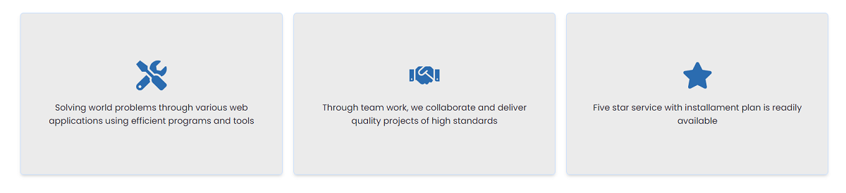
Let's examine the code below
import React from 'react';
import { Flex, Spacer, Text, useMediaQuery, Icon } from '@chakra-ui/react';
import { FaTools, FaHandshake, FaStar } from 'react-icons/fa';

const AboutUs = () => {
  const [isLargerThan48] = useMediaQuery('(min-width: 48em)');

  const array = [
    {
      id: 1,
      text: ' Solving world ... [truncated]',
      icon: FaTools,
    },
    {
      id: 2,
      text: 'Through team work, ... [truncated]',
      icon: FaHandshake,
    },
    {
      id: 3,
      text: 'Five star service with ... [truncated]',
      icon: FaStar,
    },
  ];

  return (
    <Flex
      minH="70vh"
      alignItems="center"
      justifyContent="space-between"
      w="full"
      py="16"
      px={isLargerThan48 ? '16' : '6'}
      flexWrap="wrap"
      flexDirection={isLargerThan48 ? 'row' : 'column'}
    >
      {array.map((arr) => (
        <>
          <Flex
            height="300px"
            bg="blackAlpha.200"
            width={isLargerThan48 ? '32%' : 'full'}
            shadow="md"
            p="6"
            alignItems="center"
            justifyContent="center"
            borderRadius="md"
            flexDirection="column"
            textAlign="center"
            mb={isLargerThan48 ? '0' : '4'}
            border="1px solid #C4DDFF"
          >
            <Icon as={arr.icon} boxSize={14} color="blue.600" mb="5" />
            <Text>{arr.text}</Text>
          </Flex>

          <Spacer />
        </>
      ))}
    </Flex>
  );
};

export default AboutUs;
From the code snippet above:
- I installed a package called
react-iconsand importedFaTools,FaHandshake, andFaStar. Chakra UIdoes not have a vast library of icons, but it provides a simple way to extend the package. Read more about using a third-party icon library.useMediaQuerychecks if the screen size is bigger than48em.isLargerThan48holds the boolean value returned fromuseMediaQuery.Arrayholds the content to display on the screen, then maps the contents into view.
✨ Services Component
This component uses an image on the left that might be used to present the team behind your project.

Let's analyze the code below:
import {
  Flex,
  Spacer,
  Image,
  Text,
  Button,
  useMediaQuery,
} from '@chakra-ui/react';
import React from 'react';
import teamImage from '../assets/teamImage.jpg';

const Services = () => {
  const [isLargerThan62] = useMediaQuery('(min-width: 62em)');

  return (
    <Flex
      width="full"
      minHeight="70vh"
      alignItems="center"
      px={isLargerThan62 ? '16' : '6'}
      py="16"
      justifyContent="center"
      flexDirection={isLargerThan62 ? 'row' : 'column'}
    >
      <Flex
        w={isLargerThan62 ? '40%' : 'full'}
        mb={isLargerThan62 ? '0' : '6'}
        alignItems="center"
        justifyContent="center"
      >
        <Image src={teamImage} alt="Chakra Team" w="full" />
      </Flex>

      <Spacer />

      <Flex
        w={isLargerThan62 ? '60%' : 'full'}
        flexDirection="column"
        ml={isLargerThan62 ? '7' : '0'}
      >
        <Text fontSize={isLargerThan62 ? '5xl' : '4xl'} fontWeight="bold">
          We build, We revive
        </Text>

        <Text mb="6" opacity="0.8">
          Your business needs to be .. [truncated]
        </Text>

        <Button width="200px" size="lg" colorScheme="blue">
          CONTACT US
        </Button>
      </Flex>
    </Flex>
  );
};

export default Services;
From the code above, Chakra UI provides an Image component that is used to display images. It also accepts the same props as the IMG tag in HTML.
✨ Coding the Footer Component
In this section, we will build the footer section of the webpage and learn about the Link component in Chakra UI.

import { Flex, Text, Link } from '@chakra-ui/react';
import React from 'react';

const Footer = () => {
  return (
    <Flex
      w="full"
      bg="blackAlpha.50"
      minHeight="20vh"
      flexDirection="column"
      alignItems="center"
      textAlign="center"
      justifyContent="center"
    >
      <Text mb="3">
        Provided by{' '}
        <Link href="https://appseed.us" isExternal color="blue.500">
          AppSeed
        </Link>
      </Text>
      <Text opacity="0.5">Open-Source Sample - Buit with Chakra UI</Text>
    </Flex>
  );
};

export default Footer;
From the code snippet above:
Linkis a component that is used to navigate to various parts of the website or an external resource.Linkaccepts anisExternalprop for links to external resources.
✨ Enable Dark Mode
This section explains how to enable dark mode and add custom color schemes using the useColorModeValue. Here are the steps:
👉 #1 - Create atheme.jsfile in thesrcfolder and importextendTheme
//in theme.js

import { extendTheme } from '@chakra-ui/react';
👉 #2 - Create a config object containing two properties -initialColorModeanduseSystemColorMode.
import { extendTheme } from '@chakra-ui/react';
const config = {
  initialColorMode: 'light',
  useSystemColorMode: false,
};
From the code snippet above:
initialColorModerepresents the initial colour mode shown when a user visits your website for the first time.useSystemColorMode- can either be true or false.
👉 #3 - Create a theme variable and export the config using extendTheme. import { extendTheme } from '@chakra-ui/react';
const config = {
initialColorMode: 'light',
useSystemColorMode: false,
};
const theme = extendTheme({ config });
export default theme;
👉 #4 - Edit theindex.js fileto useChakraProvider
Import ChakraProvider and ColorModeScript from Chakra UI and theme from theme.js.
import { ChakraProvider, ColorModeScript } from '@chakra-ui/react';
import theme from './theme'
👉 #5 - Enable the access to the theme settings (all components)
import { ChakraProvider, ColorModeScript } from '@chakra-ui/react';
import theme from './theme';

const root = ReactDOM.createRoot(document.getElementById('root'));
root.render(
  <ChakraProvider>
    <ColorModeScript initialColorMode={theme.config.initialColorMode} />
    <App />
  </ChakraProvider>
);
Finally, we have set up dark mode in our web application. Next, let's learn how to switch between the light and dark colour modes.
✨ Switching dark / light mode
In this section, we will create a switch that can be used to toggle between light and dark modes.

👉 1# - Open the src/components/Nav.js and import the following:import { useColorMode, useColorModeValue } from '@chakra-ui/react';
/*
useColorMode is a hook that selects and toggles between different colour modes.
useColorModeValue is a hook that allows you to select the colour you want a Chakra UI component to change to.
*/
👉 2# - Declare the hooks in the component.
import { useColorMode, useColorModeValue } from '@chakra-ui/react';

const Nav = () => {
  const { colorMode, toggleColorMode } = useColorMode();
  const navBg = useColorModeValue('white', 'blackAlpha.200');
  ....
  ....
    return (
    <Flex
      bg={navBg}
    >
    ....
    ....
    </Flex>
  )
}

export default Nav;
From the code snippet above
colorModeholds the currentcolourscheme, andtoggleColorModeis the function that changes thecolourscheme from light to dark.navBgis a variable that dictates the exact colour the Flex component should have in both colour modes. Inlight mode, the background colour will bewhite, and indark mode, it will beblackAlpha.200.
👉 3# - Add the icon that toggles the colour mode when clicked
import { useColorMode, useColorModeValue, Icon } from '@chakra-ui/react';
import { MoonIcon, SunIcon } from '@chakra-ui/icons';

const Nav = () => {
  const { colorMode, toggleColorMode } = useColorMode();
  const navBg = useColorModeValue('white', 'blackAlpha.200');
  ....
  ....
    return (
    <Flex
      bg={navBg}
    >
    <IconButton onClick={toggleColorMode}>
      {colorMode === 'light' ? <MoonIcon /> : <SunIcon />}
    </IconButton>
  ....
    ....
    </Flex>
  )
}

export default Nav;
From the code snippet above:
- If
colorModeis light, it shows the Moon icon otherwise it shows the Sun icon. - When the icon is clicked, it also calls the
toggleColorModefunction.
✨ Conclusions & Resources
In this article, we've been able to build a complete and fully responsive webpage using Chakra UI. You have also learned about various layout components available in Chakra UI.
Chakra UI enables you to build a modern website with less code. With its easy-to-navigate documentation, you can learn about the various layout components and features Chakra UI provides.
It provides a clean and efficient way to change colour modes using local storage. If you want to build a website that allows users to select different colour schemes, Chakra UI is an excellent choice.
Thanks for reading! For more resources, feel free to access Free Chakra UI Templates (a curated list)
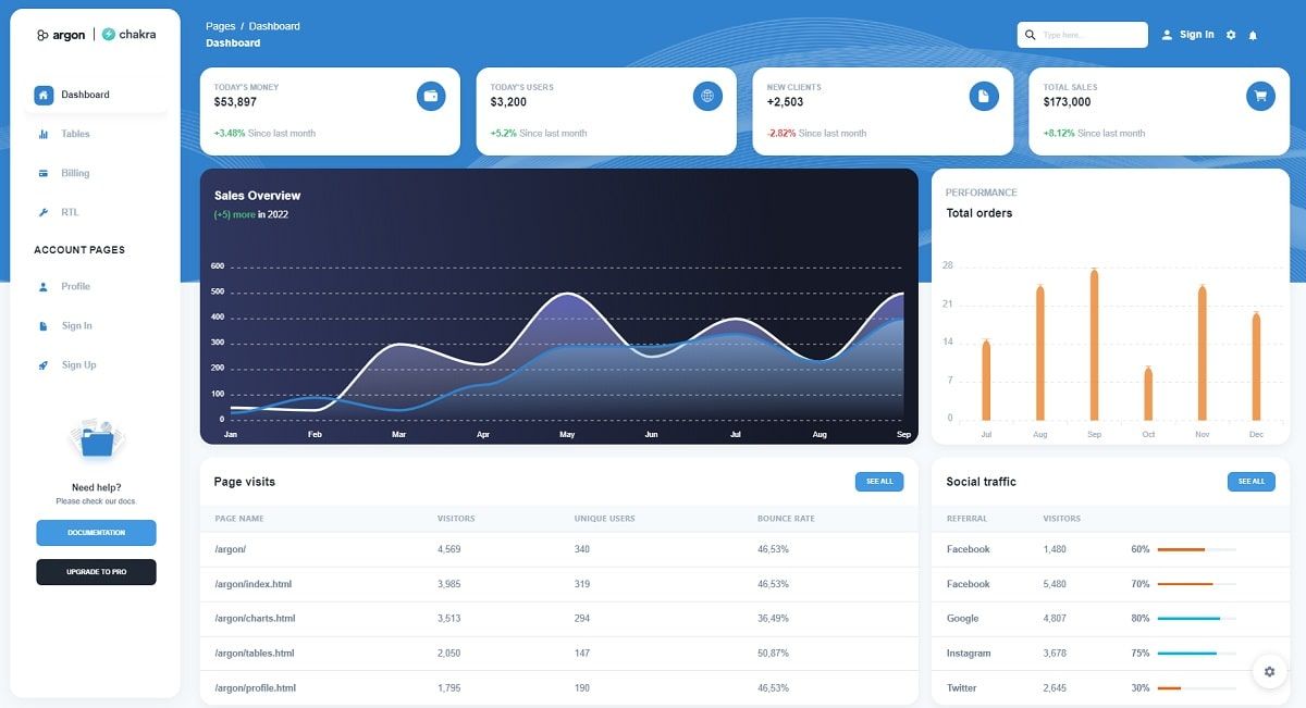
✨ Argon Dashboard Chakra
Start your Development with an Innovative Admin Template for Chakra UI and React. If you like the look & feel of the hottest design trend right now, Argon Dashboard Chakra, you will fall in love with this dashboard! It features a huge number of components built to fit together and look amazing.
- 👉 Argon Dashboard Chakra - product page
- 👉 Argon Dashboard Chakra - LIVE demo
Argon Dashboard Chakra is built with over 70+ frontend individual elements, like buttons, inputs, navbars, nav tabs, cards, or alerts, giving you the freedom of choosing and combining.
✨ Purity UI Dashboard
This Free Chakra UI Dashboard is coming with prebuilt design blocks, so the development process is seamless, switching from our pages to the real website is very easy to be done.
- 👉 Purity UI Dashboard - product page
- 👉 Purity UI Dashboard - LIVE Demo
If you want to get inspiration or just show something directly to your clients, you can jump-start your development with our pre-built example pages. You will be able to quickly set up the basic structure for your web project.

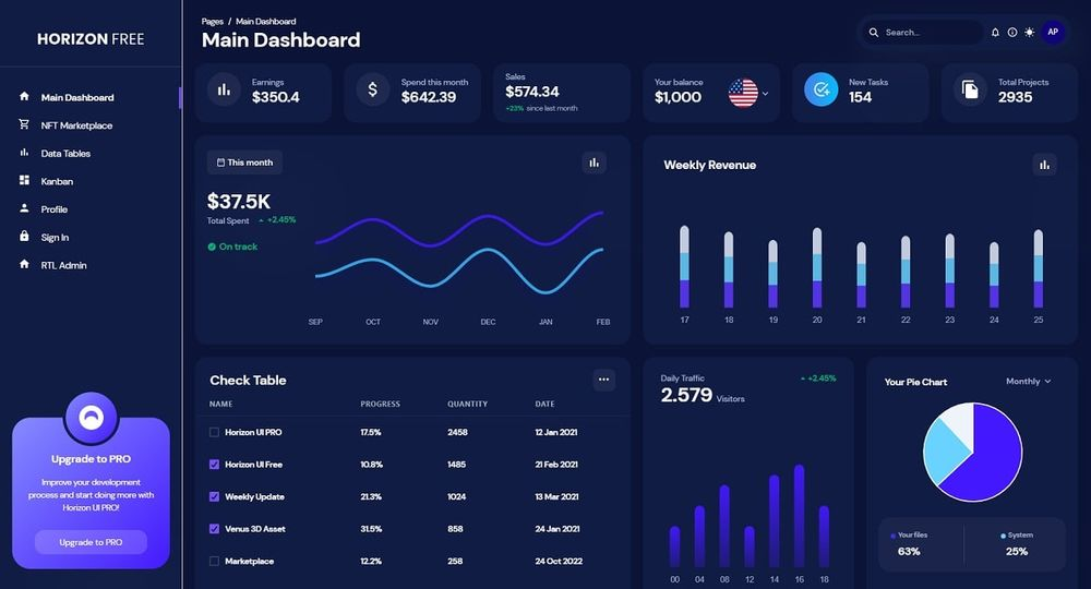
✨ Horizon UI Dashboard
Horizon UI is built to save a lot of time going from prototyping to full-functional code due to pages categories like NFTs page, Dashboard, Kanban, and so on. Horizon UI is also coming with prebuilt design cards, so the development process is seamless; switching from code to the real website or web app is very easy to be done.
- 👉 Horizon UI - LIVE Demo
- 👉 Horizon UI - Product page