MUI React - Coding a Simple Landing Page
Learn how to code a simple landing page with MUI Library and React - Sample Code available on Github.


Hello! This article explains how to use the React MUI Library and code a simple, responsive landing page. The page will be built with MUI components only, no HTML element will be used. For newcomers, MUI is a popular components library powered by React. Thanks for Reading!
- 👉 MUI Landing Page - Sample LIVE Demo
- 👉 MUI Landing Page - Source Code (all components)
Before React.js, building web applications can be a daunting task. There was no ability to re-use web layouts or follow the DRY (Don't Repeat Yourself) principle with HTML. Therefore, we wrote repeated lines of code that were difficult to understand.
Does React.js make building web applications easier? Let's find out via the following topics:
- ✅ What is
React - ✅
MUIIntroduction - Reasons to use it - ✅
MUIInstallation - ✅ Generate the project via
CRA(create-react-app) - ✅ Styling in
MUIusingmakeStyleshook - ✅ Coding Sections: Header, Hero, Information, Contact, Footer
- ✅ How to change
MUIFont - ✅ Presents
Open-SourceMUI Dashboard: Berry - ✅ Links & Resources (all free)

✨ What is React
React.js is a JavaScript library that allows you to build fast and efficient web applications using the minimum amount of code possible. In React.js, you can break the web layout into components - reusable bits of code that return HTML elements.
It also allows us to pass data into these components to create dynamic content for our web pages. These data are called props. React.js has excellent documentation with tons of helpful resources and a large community of users willing to help you learn effectively.
New to React? Check out this comprehensive React Starting Guide
✨ Material UI Library
Material UI is a library that contains several React components that are flexible, mobile responsive, and production-ready. These components allow you to create stunning user interfaces with ease, and you always have complete control over their appearance and behavior.
With over 2000 contributors to its documentation, MUI is developer-friendly and provides an exciting experience for new users.
However, before we proceed, let's look at five reasons you should use the MUI library in React.js.
✨ MUI - Reasons to use it
MUI Library stands out from the rest because it provides the following:
Mobile-first Approach
MUI encourages a uniform and user-friendly layout across different platforms and screen sizes. It provides several helpers that enable you to build a mobile-friendly web application. MUI comes with different breakpoints for different screen sizes, and you can edit the default screen sizes to your preferred choice if necessary.
Faster build time
MUI has every web component you need to build any web application, and it's easy to integrate into your web applications. MUI speeds up your development process and enables you to ship beautiful and modern web applications faster.
Excellent Documentation
MUI's documentation is straightforward. So you don't have to go elsewhere to search for how to implement any feature you need. Every web component, how to use them, and code samples are available in the documentation.
Highly Customizable
MUI components are highly customizable. You have complete control over their appearance and behavior. MUI allows you to write custom CSS styles to edit the components or pass some props stated in the documentation.
Beautiful ready-made components
MUI provides beautiful production-ready components for you. By simply copying and pasting the code, you can build a complex layout in a few minutes.
✨ MUI Installation and Set up
In order to start coding or using the free sample provided by this tutorial, we need NodeJS properly installed and accessible in the terminal.
New to NodeJS? Check out this comprehensive Node JS Starting Guide 
Once the NodeJS tools are accessible, we can move forward and code our sample. Here are the steps:
- Generate the app skeleton using
CRAtool - Install MUI Components and SVG Icons
- Open the project using a modern editor like
VsCodeorSublime - Update
App.jsto include the newly installed assets
$ npx create-react-app reactmui
$ npm install @mui/material @emotion/react @emotion/styled
$ npm install @mui/icons-material
$ npm start The App.js will be edited to include all the components coded in the next sections:
import CssBaseline from '@mui/material/CssBaseline';
function App() {
  return (
    <div>
      <CssBaseline />
      <Header />
      <Hero />
      <Section />
      <AboutUs />
      <Testimonial />
      <ContactUs />
      <Footer />
    </div>
  );
}

export default App;
The web application is divided into six components: header, hero, section, about us, testimonial, contact us, and footer.
CSS Baseline component adds simple base styles provided by MUI to the web application. It removes the margin in all browsers and sets the box-sizing property to border-box.
✨ Styling in MUI
Styling MUI components may seem confusing at first to beginners because it's quite different from the conventional way of styling HTML or React applications. But don't worry, the aim of this article is to explain it clearly.
To edit these components provided by MUI, you have to do the following:
- 👉 Install
mui/styles - 👉 Create a new folder named
styles - 👉 Create a
styles.jsfile instylesdir and add the code:
// src/styles/styles.js

import { makeStyles } from '@mui/styles';

const styles = () => {
  return {
    //box: {
    //   backgroundColor: "red"
    // },
    // text: {
    //  color: "pink"
    //}
  };
};

const useStyles = makeStyles(styles);
export default useStyles; The above code does the following:
- Import
makeStylesfrom@mui/styles. - Invoke
makeStyles, a higher-order function that accepts a sub-function (another function) that returns an object containing classNames and the styles applied. stylesis our sub-function used bymakeStyles- Defines
useStylesa custom hook that passes the styles created above into the makeStyles function.useStylesbasically, helps us to style all the new components coded in the next sections.
How to use custom styling hook in MUI
Let's see a quick demo on how to apply the styles above in React components.
import React from 'react';
import { Box, Typography } from '@mui/material';
import useStyles from '../styles/styles';         // <-- Import

const Component = () => {
  const classes = useStyles();

  return (
    <Box className={classes.box}>                 // <-- Use
      <Typography className={classes.text}>I am a text</Typography>
    </Box>
  );
};

export default Component; Using this mechanism, we can inject styling into every component using a clean syntax thanks to MUI's beautiful architecture.
✨ Coding MUI Header component
Here, the header component is our navigation bar, but building a navigation bar in MUI is quite different from HTML. In MUI, the navigation bar is called the App bar, and it has different types. I will be using the Elevate App Bar.
Header Component - Source Code


The relevant Code, extracted from the MUI Header Component File
    <Box sx={{ marginBottom: '70px' }}>
      <ElevationScroll {..props}>
        <AppBar>
          <Toolbar className={classes.toolBar}>
            <Link href="#" underline="none">
              <Typography variant="h5" className={classes.logo}>
                MUI Sample
              </Typography>
            </Link>

              <Box>
              <IconButton
                size="large"
                edge="end"
                color="inherit"
                aria-label="menu"
                onClick={toggleDrawer('right', true)}
              >
                <MenuIcon className={classes.menuIcon} fontSize="" />
              </IconButton>

              <Drawer
                anchor="right"
                open={state['right']}
                onClose={toggleDrawer('right', false)}
              >
                {list('right')}
              </Drawer>
            </Box>

			{links.map((link) => (
               <Link href={link.url} key={link.id}>
               		<Typography>{link.route}</Typography>
                </Link>
              ))}
            </Box>}

          </Toolbar>
        </AppBar>
      </ElevationScroll>
</Box>The (simplified) above code does the following:
- The
MUIApp Bar segment elevates the navigation bar on scroll - when the user is not at the top of the page. - Using this type of
Appbar requires you to wrap yourAppBarwith the<ElevationScroll/>tag. Typographyis used for texts. It takes thevariantparameter to specify whether it's a heading or a paragraph tag.Boxis similar to the<div>tag inHTML. It serves as a parent element.Linkis similar to the<a>tag inHTML. It creates a hyperlink to internal and external resources in your web application.- The
toolbaris theMUIcomponent that wraps all the elements in theAppBar. - I also imported the
useStyleshook we created in the previous section. This hook is declared inside the component and passed into a variable, like this constclasses = useStyles()the classes variable becomes an object containing all the classNames declared in the stylesheet.
Let's edit the styles in styles.js
const styles = () => {
  return {
    toolBar: {
      height: '10vh',
      display: 'flex',
      justifyContent: 'space-between',
      padding: '20px',
      backgroundColor: 'white',
    },
    logo: {
      color: 'blue',
      cursor: 'pointer',
    },
    link: {
      color: '#000',
    },
  };
};

const useStyles = makeStyles(styles);
export default useStyles; ✨ Coding MUI Hero Component
In this section, I introduced the Grid layout. The Grid component displays contents in a responsive layout by dividing the screen into 12 cells.
Hero Component - Source Code

The code is fairly simple compared to the (previous) Header Component
const Hero = () => {
  const classes = useStyles();

  return (
    <Box className={classes.heroBox}>
      <Grid container spacing={6} className={classes.gridContainer}>
        <Grid item xs={12} md={7}>
          <Typography variant="h3" className={classes.title}>
            Let's scale your business
          </Typography>
          <Typography variant="h6" className={classes.subtitle}>
            Hire professionals who [..truccated..] we are your best client.
          </Typography>
          <Button
            variant="contained"
            color="primary"
            sx={{ width: '200px', fontSize: '16px' }}
          >
            HIRE US
          </Button>
        </Grid>
        <Grid item xs={12} md={5}>
          <img src={myteam} alt="My Team" className={classes.largeImage} />
        </Grid>
      </Grid>
    </Box>
  );
};

export default Hero;✨ Coding MUI Section Component
This component displays a Grid container containing three Grid items.
Section Component - Source Code
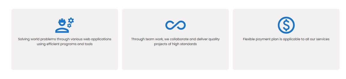
The source code for this component defines three cells managed by a parent MUI Grid component.
    <Box sx={{ flexGrow: 1, minHeight: '400px' }}>
      <Grid container className={classes.sectionGridContainer}>
        {sectionItems.map((item) => (
          <Grid
            item
            xs={12}
            md={3.5}
            minHeight={300}
            key={item.id}
            className={classes.sectionGridItem}
          >
            {item.icon}
            <Typography>{item.sentence}</Typography>
          </Grid>
        ))}
      </Grid>
</Box>✨ Coding MUI Contact Component
This component implements a simple form with a Title, three input fields and a submit button
Contact Form Component - Source Code
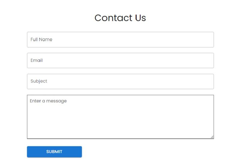
Here is the code for this simple form powered by MUI:
    <Box className={classes.formContainer}>

      <Typography variant="h4" className={classes.formHeading}>
        Contact Us
      </Typography>
      <Box
        className={classes.form}
        component="form"
        noValidate
        autoComplete="off"
      >
        <TextField
          label="Full Name"
          variant="outlined"
          fullWidth
          className={classes.inputField}
          value={firstName}
          onChange={(e) => setFirstName(e.target.value)}
        />

        <TextField
          label="Email"
          variant="outlined"
          fullWidth
          className={classes.inputField}
          value={email}
          onChange={(e) => setEmail(e.target.value)}
        />

        <TextareaAutosize
          aria-label="minimum height"
          minRows={6}
          placeholder="Enter a message"
          className={classes.textArea}
          spellCheck
          value={message}
          onChange={(e) => setMessage(e.target.value)}
        />

        <Button
          variant="contained"
          type="submit"
          color="primary"
          sx={{ width: '200px', fontSize: '16px' }}
          onClick={submitForm}
        >
          Submit
        </Button>
      </Box>
</Box>✨ Coding MUI Footer
Our MUI sample page provides a simple footer with a centered text crafted on top of Box, Typography, and Link MUI Components.
Footer Component - Source Code

Relevant Source code for the MUI Footer Component
    <Box sx={{ flexGrow: 1 }} className={classes.footerContainer}>
      <Typography className={classes.footerText}>
        Provided by{' '}
        <Link href="https://appseed.us" underline="none">
          AppSeed
        </Link>
      </Typography>
      <Typography className={classes.footerDate}>
          Open-Source Sample - Buit with MUI
      </Typography>
</Box>✨ How to change MUI Font
Material UI allows you to use any font you want to use. To change the font of all Material UI components, do the following:
- Open
App.jsand import thecreateThemeandThemeProviderfromMUIcore. - Edit the
font-familyof the typography component viacreateTheme.
Here is the code for our App.js landing page with all components styled with the new font: Poppins instead of the default font Roboto.
const theme = createTheme({
  typography: {
    fontFamily: ['Poppins', 'sans-serif'].join(','),
  },
});

function App() {
  return (
    <>
      <ThemeProvider theme={theme}>
        <CssBaseline />
        <Header />
        <Hero />
        <Section />
        <AboutUs />
        <Testimonial />
        <ContactUs />
        <Footer />
      </ThemeProvider>
    </>
  );
}

export default App; ✨ Conclusions and Free Resources
In this article, we've been able to build a complete webpage using various Material UI components. Material UI provides a comprehensive set of UI tools you may need to create a modern web application.
- 👉 Material UI - official documentation
- 👉 Open-Source MUI Templates - a curated list
With its straightforward documentation, you can easily find the web layouts you need and build a complete web application in a shorter amount of time.
✨ React NodeJS Berry
Berry is a creative React Dashboard built using the Material-UI. It is meant to be the best User Experience with highly customizable feature-riched pages. It is a complete game-changer React Dashboard with an easy and intuitive responsive design on retina screens or laptops.
- 👉 React Node JS Berry - product page
- 👉 React Node JS Berry - LIVE Demo
The product comes with a simple JWT authentication flow: login/register/logout powered by an open-source Node JS API Backend via Passport Library.