Bootstrap for Beginners - Code a Simple Dashboard Layout
Learn how to code a simple Dashboard Page from scratch using Bootstrap 5 and a lightweight CSS file - The Sample can be downloaded from GH.

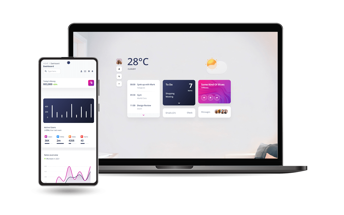
Hello! This article explains how to code a simple One-page Dashboard Layout in Bootstrap 5, using the theory from a previous article: Bootstrap - Tutorial for Beginners. The source code for the final project can be downloaded from Github and used in commercial projects or simply for eLearning activities. For newcomers, Bootstrap is a leading JS/CSS framework used to code responsive websites and apps. Thanks for reading!
- 👉 Bootstrap 5 Dashboard - LIVE Demo
- 👉 Bootstrap 5 Dashboard - Source Code
This simple Dashboard provides also a dark-mode switcher positioned on the left sidebar (sources available on GH).
✨ Topics
- 👉
Bootstrap- Short Presentation - 👉 How to
install and use Bootstrap - 👉 Coding the
navbar - 👉 Coding the
sidebar - 👉 Main Content: cards, charts, and data tables
- 👉
Dark Mode - 👉 Links &
Resources
✨ Bootstrap Short Intro
Bootstrap is a popular JS/CSS Framework for developing responsive and mobile-first websites, that provides HTML, CSS, and JavaScript-based design templates for almost anything, including (but not limited to): typography, forms, buttons, navigation, and other components.
The primary purpose of adding Bootstrap to a project is to apply Bootstrap's choices of color, size, font, and layout to that project. Currently, Bootstrap 5 is the newest version of Bootstrap, with new components, a faster stylesheet, and more responsiveness.
For more information, feel free to access the official website and docs.
✨ How to use Bootstrap
The easier way to use Bootstrap in a new project is to include all mandatory assets from a CDN (Content Delivery Network). Let's create a new directory for our project with an index.html file, where the new HTML code will be added.
<html lang="en">
<head>
    <meta charset="UTF-8">
    <meta http-equiv="X-UA-Compatible" content="IE=edge">
    <meta name="viewport" content="width=device-width, initial-scale=1.0">
    <title>Bootstrap Landing Page</title>
</head>
<body>
    <!-- Page Content here -->
</body>
</html>
To speed up our development, we can use a modern programming editor like VsCode or Atom, which comes with modules and many features like code completion and highlighting. Below is the download link for the VsCode:
- 👉 VsCode - download page
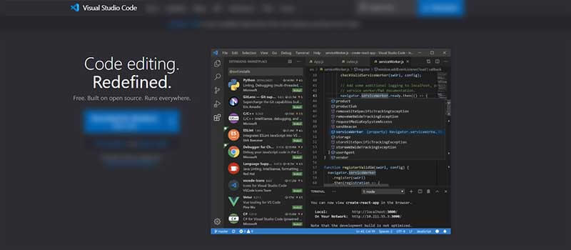
Once the VsCode is installed, we can open our project by typing code . in the working directory (where index.html is saved).
✨ Coding the Navbar
Go to this link and copy the first navbar that has the search bar. Let’s change both the navbar-light and bg-light to dark. We will change the search bar to something nicer, for this we’ll use Input Groups.
<div class="input-group">
  <input type="text" class="form-control" placeholder="Recipient's username" aria-label="Recipient's username" aria-describedby="button-addon2">
  <button class="btn btn-outline-secondary" type="button" id="button-addon2">Button</button>
</div>
To use Bootstrap 5 icons, we will import them using CDN:
<link rel="stylesheet" href="https://cdn.jsdelivr.net/npm/bootstrap-icons@1.8.1/font/bootstrap-icons.css">Copy and paste this line of code inside your <head> element.
To make the navbar more appealing, we will change the search button with an icon for a nicer layout.

To make this change we need to copy the search icon code and paste it into the button snippet.

We’re going to do the same thing to the Dropdown text. I’m using an icon of a user.
<i class="bi bi-person-square"></i>We have to fix the dropdown menu as well because right now it goes offscreen. Add dropdown-menu-end to dropdown-menu class. This fixes the problem.
Let’s make the navbar-brand font bolder by adding fw-bold to the navbar-brand class.
At this point, all we have is a simple navbar. Let's move forward and code the sidebar.
✨ Dashboard Sidebar
Bootstrap provides Offcanvas, a basic sidebar component that can be toggled via JavaScript to appear from any edge of the viewport.
The code for our sidebar is this one:
<div class="offcanvas offcanvas-start side-bar"
     data-bs-scroll="true"
     tabindex="-1"
     id="offcanvas"
     aria-labelledby="offcanvas">
    <div class="offcanvas-header">
        <h5 class="offcanvas-title" id="offcanvas">Sample Heading</h5>
        <button type="button"
                class="btn-close text-reset"
                data-bs-dismiss="offcanvas"
                aria-label="Close"></button>
    </div>
    <div class="offcanvas-body">
        <p>Sample Paragraph</p>
    </div>
</div>
For a nice integration with the navbar we need to add some CSS code listed below:
/* sidebar width */
.side-bar
{
    width: var(--offcanvas-width);
}

/* sidebar links */
.sidebar-link
{
    display: flex;
    align-items: center;
}

.sidebar-link .right-icon
{
    display: inline-flex;
    transition: all ease 0.5s;
}
✨ Main Content
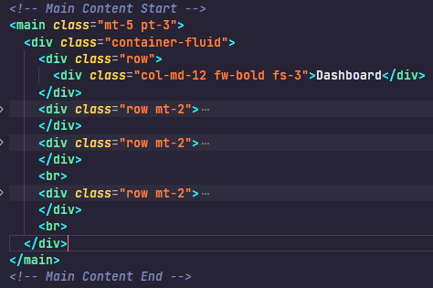
After the sidebar, we’re going to create the main element with a class of mt-5 pt-3.
Right now our content inside the main element is overlapping with our sidebar, to fix it we need to style it. Inside our css media tag, create a new line for main.
Add this code inside it: margin-left: var(--offcanvas-width);. I’m going to make our navbar fixed to the top. To do this I need to add fixed-top class to the navbar class:

Back in our index.html file, let’s start adding content to our main class. Add a container-fluid, row and a col-md-12:

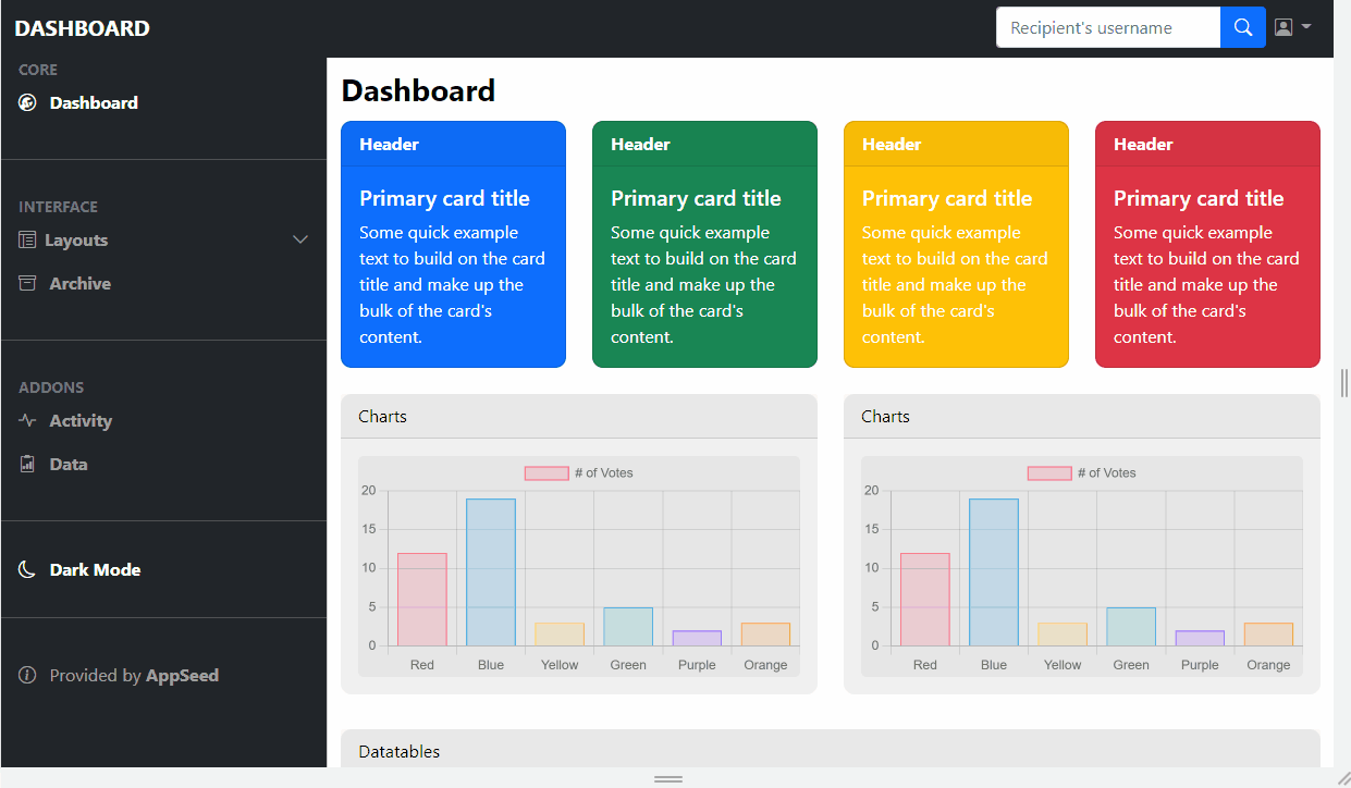
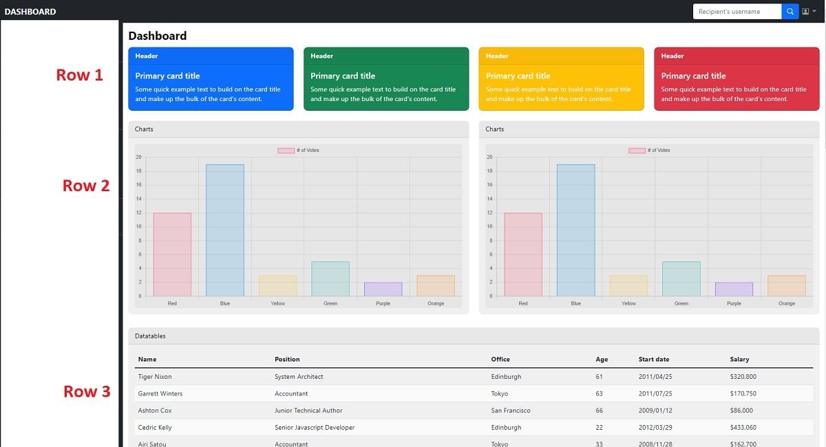
The center of the page will contain three rows:
- 👉
Info cards - 👉
Charts- Powered byChart.js - 👉
Data Tableswith paginated information.
Let's break down all these containers and code the HTML and CSS for each section.
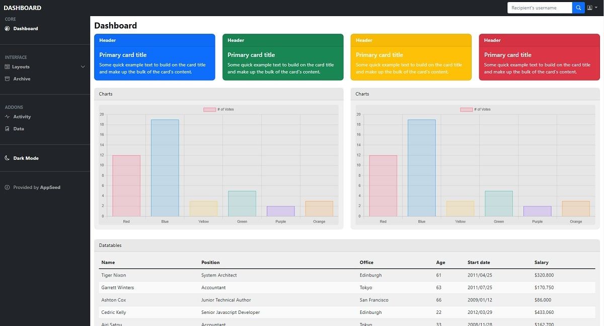
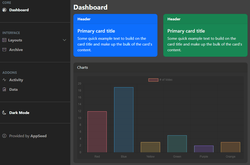
👉 Main Content - Cards
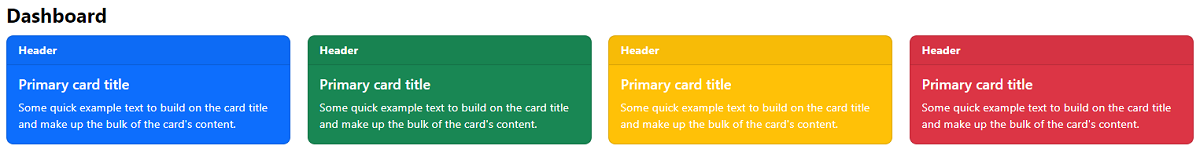
Each container (cards, charts ..) will have a parent row where all the HTML code lives. Here is the basic card code for the cards section:
<div class="card text-white bg-primary mb-3"
     style="max-width: 18rem;">
  <div class="card-header">Header</div>
  <div class="card-body">
    <h5 class="card-title">Primary card title</h5>
    <p class="card-text">Some quick example [.. truncated content ..]</p>
  </div>
</div>
When we use col-md-3, we can fit 4 cards next to each other because Bootstrap has a 12-column grid.
For a colorful layout, we can change the color of the cards by changing the line bg-primary to danger, warning .. etc. Here is the output:
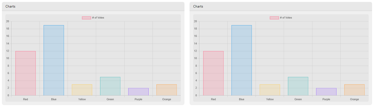
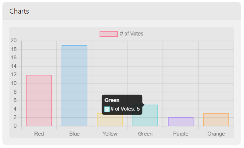
👉 Main Content - Charts
For the charts section, we will use a 3rd party open-source JS library used to display a simple and colorful bar chart. Each chart lives into a card responsive container that uses 6 cells each.
To code this section, here is the HTML for the card:
<div class="card">
      <div class="card-header">Charts</div>
          <div class="card-body">
            <canvas class="chart" width="400" height="200"></canvas>
      </div>
</div>
We have to make a new folder called js. Inside it, create a new file called script.js. Inside this new file, the following code that builds the charts should be added:
const charts = document.querySelectorAll(".chart");

charts.forEach(function (chart) {
  var ctx = chart.getContext("2d");
  var myChart = new Chart(ctx, {
    type: "bar",
    data: {
      labels: ["Red", "Blue", "Yellow", "Green", "Purple", "Orange"],
      datasets: [
        {
          label: "# of Votes",
          data: [12, 19, 3, 5, 2, 3],
          backgroundColor: [
            "rgba(255, 99, 132, 0.2)",
            "rgba(54, 162, 235, 0.2)",
            "rgba(255, 206, 86, 0.2)",
            "rgba(75, 192, 192, 0.2)",
            "rgba(153, 102, 255, 0.2)",
            "rgba(255, 159, 64, 0.2)",
          ],
          borderColor: [
            "rgba(255, 99, 132, 1)",
            "rgba(54, 162, 235, 1)",
            "rgba(255, 206, 86, 1)",
            "rgba(75, 192, 192, 1)",
            "rgba(153, 102, 255, 1)",
            "rgba(255, 159, 64, 1)",
          ],
          borderWidth: 1,
        },
      ],
    },
    options: {
      scales: {
        y: {
          beginAtZero: true,
        },
      },
    },
  });
});
In human language, the above JavaScript snippet identifies the cards and injects the data that is translated by the Chart.js library into colorful bar charts.
Of course, Chart.js should be added as a runtime dependency in the index.html file (via a distant CDN).
<script src="https://cdn.jsdelivr.net/npm/chart.js@3.0.2/dist/chart.min.js"></script>👉 Main Content - Data Tables
For newcomers, data tables provide access to a large amount of data using a paginated layout. Once the necessary code is finished, we should have something similar to this:
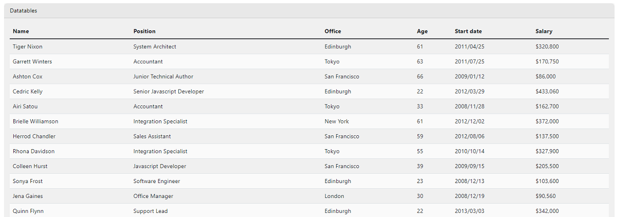
To code this useful component, we need a new row, a card, and a card header. After that, we will create a card-body and then a table-responsive div class.
Go to this link (Bootstrap Component) and copy the whole HTML section. Paste the whole thing after your table-responsive class. Change the class=”display” to class="table data-table".
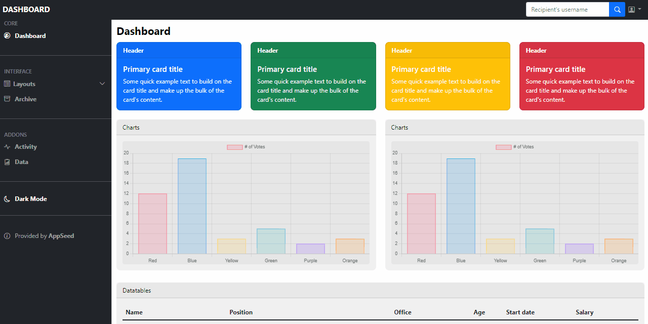
👉 Main Content Styling
At this point, our dashboard page has all the elements (top cards, charts, and data tables) but the layout is not yet optimized for a nice user experience. Here are the steps for a nicer layout.
Add br element after charts and datatables sectionsThis action will increase the space between the rows so the users enjoy more the content provided by each section.
Let’s make the card borders round and give charts, datatable new colors.
The CSS code should be added to the style.css file:
/* table styling */
.card,
.card-chart,
.card-table
{
    border-radius: 10px;
}

.card-chart
{
    background: rgb(240, 240, 240);
}

.chart
{
    background: rgb(230, 230, 230);
    border-radius: 5px;
}

.card-table
{
    background: rgb(240, 240, 240);
}
We’ll make our table have the striped effect by coloring every even row:
/* striped table effect */
tr:nth-child(even)
{
    background-color: rgb(250, 250, 250);
}
The complete CSS code for all the above sections can be found on Github.
Bootstrap 5 Dashboard - CSS Style.
Now, we have a basic, minimal dashboard. How about adding a dark mode and letting users decide the color schema.
✨ Coding the Dark Mode
This feature aims to let the users choose how the app renders the containers: using a light or a dark background. To achieve this goal, the first thing we need to do is create two files in our js folder: dark-mode-switch.js and dark-mode-switch.min.js (open-source JS library). This will handle the switching between dark mode and light mode using the browser's local storage.
The next step is to code the dark mode control switcher as a small sidebar button.
<li class="my-4">
    <hr class="dropdown-divider">
</li>
<div class="custom-control custom-switch px-3">
    <label class="custom-control-label" for="darkSwitch">
    <span class="fw-bold">
        <i class="bi bi-moon me-2"></i>Dark Mode
    </span>
    </label>
    <input type="checkbox"
    	    class="custom-control-input checkbox ms-auto"
     		id="darkSwitch">
</div>
And the necessary CSS code:
/* checkbox */
input[type=checkbox]
{
    height: 0px;
    width: 0px;
    visibility: hidden;
}

label
{
    cursor: pointer;
}
This makes it so that the Dark Mode will have a pointer cursor when you’re on it with your mouse and changes the checkbox so that it doesn’t show at all.
Of course, we need to include the CSS code that styles the dark mode to the index.html file:
<link rel="stylesheet" href="css/dark-mode.css">The full code for the dark-mode.css is quite short and self-explanatory:
[data-theme="dark"]
{
  background: rgb(65, 65, 65);
  color: #fff;
}

[data-theme="dark"] .bg-black {
  background-color: #fff !important;
}

[data-theme="dark"] .bg-dark {
  background-color: #222 !important;
}

[data-theme="dark"] .bg-light {
  background-color: #222 !important;
}

[data-theme="dark"] .bg-white {
  background-color: #000 !important;
}
At this point, we're pretty much done with the dark mode now, all you gotta do is go on and style the charts and tables separately.
✨ Links & Resources
Curious minds can go further with their study by accessing the resources presented below:
Boostrap Basics - a comprehensive tutorial for beginers
The article presents all the basic concepts that a front end developer should know before using Boostrap full power: grid, containers, typography, colors, tables and modals.
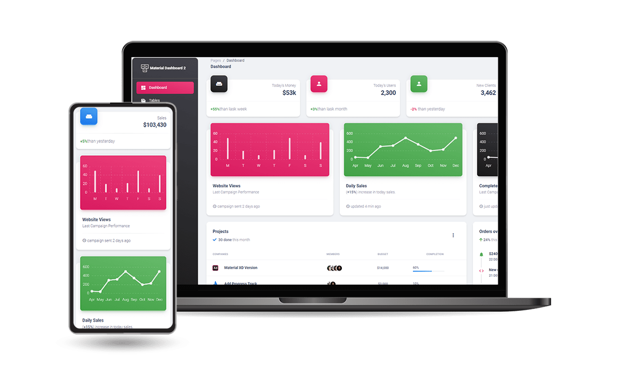
👉 Material Dashboard 2 (Free Product)
Material Dashboard 2 is built with over 60 frontend individual elements, like buttons, inputs, navbars, nav tabs, cards, or alerts, giving you the freedom of choosing and combining.
- Material Dashboard 2 - LIVE Demo
- Material Dashboard 2 - Product page
All components can take variations in color, which you can easily modify using SASS files and classes.
👉 Soft UI Dashboard (Free Product)
Designed for those who like bold elements and beautiful websites. Made of hundred of elements, designed blocks, and fully coded pages, Soft UI Dashboard is ready to help you create stunning websites and web apps.
- Soft UI Dashboard - LIVE Demo
- Soft UI Dashboard - Product page
If you want to get inspiration or just show something directly to your clients, you can jump-start your development with our pre-built example pages.