Bootstrap for Beginners - Code a Landing Page
Learn how to code a simple Landing Page from scratch using Bootstrap 5 and a lightweight CSS file - The Sample can be downloaded from GH.

Hello! This article explains how to code a simple Landing Page in Bootstrap 5, using the theory from a previous article: Bootstrap - Tutorial for Beginners. The source code for the final project can be downloaded from Github and used in commercial projects or simply for eLearning activities. For newcomers, Bootstrap is a leading JS/CSS framework used to code responsive websites and apps. Thanks for reading!
- 👉 Bootstrap 5 Landing Page - LIVE Demo
- 👉 Bootstrap 5 Landing Page - Source Code
✨ Topics
- 👉
Bootstrap- Short Presentation - 👉 How to
install and use Bootstrap - 👉 Coding the
navbar - 👉
Info component - 👉 Coding the
featuressection - 👉
Footer- dark-themed with links - 👉 Links &
Resources
✨ Bootstrap Short Intro
Bootstrap is a popular JS/CSS Framework for developing responsive and mobile-first websites, that provides HTML, CSS, and JavaScript-based design templates for almost anything, including (but not limited to): typography, forms, buttons, navigation, and other components.
This amazing framework is actively supported by programming experts and open-source enthusiasts that update the product with the latest trends and best practices used in this competitive design market.
The primary purpose of adding Bootstrap to a project is to apply Bootstrap's choices of color, size, font, and layout to that project. Currently, Bootstrap 5 is the newest version of Bootstrap, with new components, a faster stylesheet, and more responsiveness.
✨ How to use Bootstrap
The easier way to use Bootstrap in a new project is to include all mandatory assets from a CDN (Content Delivery Network). Let's create a new directory for our project with an index.html file, where the new HTML code will be added.
<html lang="en">
<head>
    <meta charset="UTF-8">
    <meta http-equiv="X-UA-Compatible" content="IE=edge">
    <meta name="viewport" content="width=device-width, initial-scale=1.0">
    <title>Bootstrap Landing Page</title>
</head>
<body>
    <!-- Page Content here -->
</body>
</html>
To speed up our development, we can use a modern programming editor like VsCode or Atom, which comes with modules and many features like code completion and highlighting. Below is the download link for the VsCode:
- 👉 VsCode - download page
Once the VsCode is installed, we can open our project by typing code . in the working directory (where index.html is saved).
✨ Coding the navbar
Bootstrap provides many navbar components that we can copy/paste into our project:
👉 Bootstrap Simple Navbar Component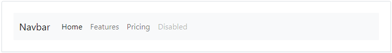
👉 Bootstrap Navbar with Search Box
👉 Bootstrap navbar with Logo
In our sample, we will use the most simple navbar version with a Brand name on the left and more links on the right of the page. Other navbar features:
Dark-ThemedSticky position- the navbar remains at the top of the page- Implements the
burger menu- for mobile views
All the necessary CSS code will be saved into a separate file named style.css that we need to create it on disk and also imported in the index.html file via link directive.
<!-- index.html (truncated content) -->
<head>
..
<link rel="stylesheet" href="css/style.css">
..
</head>
The first content added to the style.css file aims to provide a reset over the global styling of the page. Here is the code:
html,
body
{
    height: 100%;
    width:  100%;
    margin: 0;
    padding: 0;
    color:  #000;
}
Now, back to our navbar, if we try to activate the browser mobile view, we will see that the hamburger menu is not working. Let's add the necessary code (JS, CSS) to make it usable on mobile.
👉 Import Bootstrap JS Code (via CDN)
Inside the page Body element, we should include this JS file:
<script src="https://cdn.jsdelivr.net/npm/bootstrap@5.1.3/dist/js/bootstrap.bundle.min.js"></script>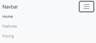
👉 Styling the Navbar Brand - the left element that is always visible
/* navbar styling */
.navbar,
.navbar-brand
{
    font-size: 1.1em;
    font-weight: 600;
    background-color: #000;
}
Next, we’re going to move the navbar links to the right with a simple line of code. The justify-content-end class moves the navbar items to the right while keeping the navbar-brand on the left. Let's see the code:
<div class="collapse navbar-collapse justify-content-end"
     id="navbarNav">
    <ul class="navbar-nav">
        <li class="nav-item">
            <a class="nav-link active" href="#">Home</a>
        </li>
        <li class="nav-item">
            <a class="nav-link" href="#">Features</a>
        </li>
        <li class="nav-item">
            <a class="nav-link" href="#">Pricing</a>
        </li>
    </ul>
</div>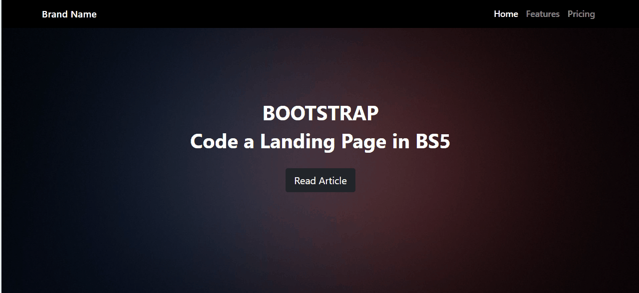
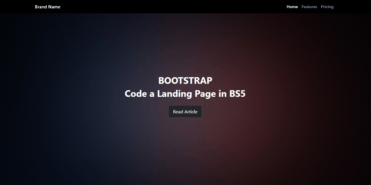
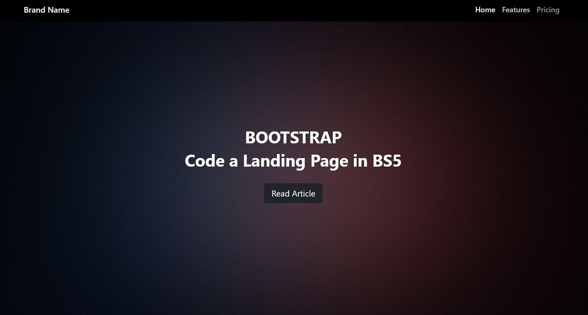
✨ Coding the hero Section
To add a catchy hero section (top of the page) with text and a button centered we need to add a new div element right after the nav section. Here is the code:
<!-- HERO Content Start -->
<div id="main">
  <div class="getstarted">
    <h1>BOOTSTRAP</h1>
    <h3>Code a Landing Page in BS5</h3>
    <a href="#" class="btn btn-dark btn-lg">Get Started</a>
  </div>
</div>
<!-- HERO Content End -->
This component identified with id=main is styled by the following snippet:
/* background styling */
#main
{
    background:url(/img/background.jpg) no-repeat center center fixed;
    display: table;
    height: 100%;
    position: relative;
    width: 100%;
    background-size: cover;
    color: #fff;
}

/* main content styling */
.getstarted
{
    display: table-cell;
    text-align: center;
    vertical-align: middle;
}
For humans, getstarted component will align the elements in the center of the page using vertical-align and text-align properties. In the background, the main div completes the layout with an image.
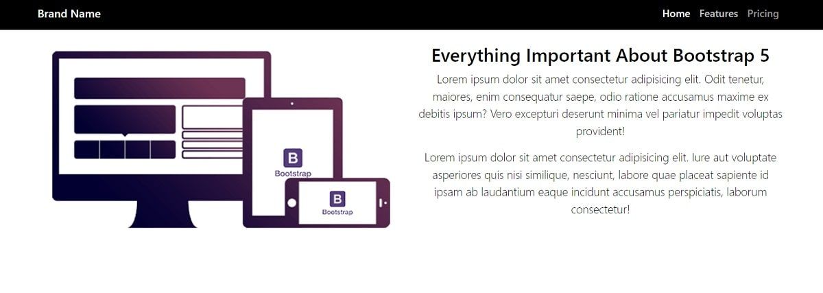
✨ Coding the Info Section
This component provides an image on the left and a presentation text on the right. To code it, we will use the grid system provided by Bootstrap where the content is managed by a row and two columns sized equally.

Here is the basic structure of the component (without the image & the text):
<div class="row">
    <div class="col-sm-6">
        <!-- Image Container -->
    </div>
    <div class="col-sm-6">
        <!-- Text Container -->
    </div>
</div>
The CSS style required by this component is pretty simple and refers to the image padding.
/* keep the image inside the containers */
.padding img
{
    width: 100%;
}
Bootstrap has a 12 columns grid which means that col-sm-6 takes up half of the page width. The title that appears on the left is styled using lead class which makes it more visible.
✨ Features Component
Next, we will make a container with a row that has four columns. Again we will start with padding class, then container, row, and then a new column class div element:
<div class="padding">
  <div class="container">
    <div class="row">
      <div class="col-lg-3 col-md-3 col-sm-6 col-xs-12">

      </div>
    </div>
  </div>
</div>
The final layout will look like the below image:
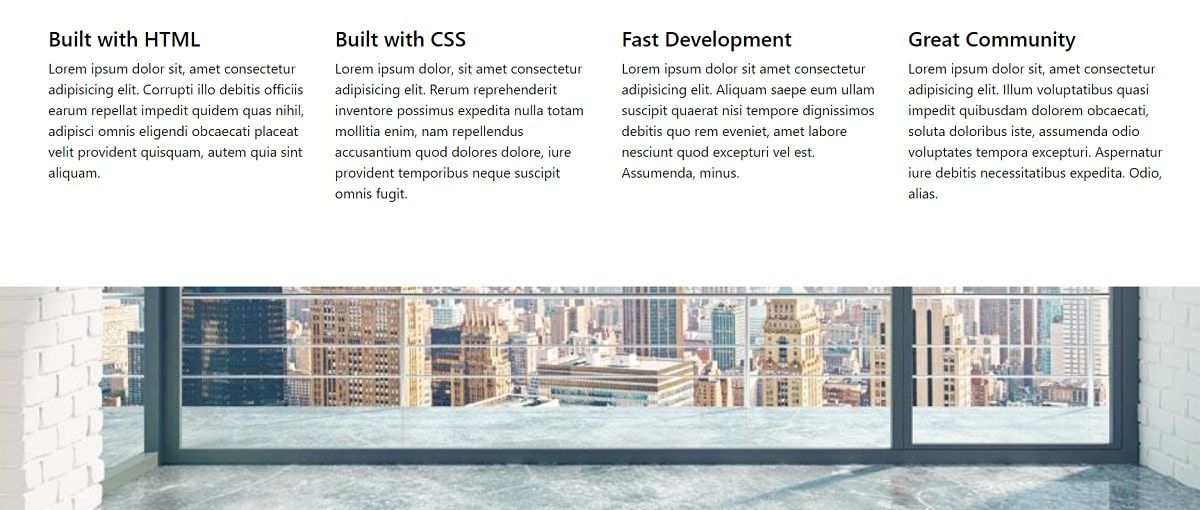
The element <div class="col-lg-3 col-md-3 col-sm-6 col-xs-12"> informs Bootstrap how many columns to show depending on the screen size. Now we need to duplicate this div element three times so we will have four columns.
For the each of the columns, a repetitive h4 title and a Paragraph structure is used:
<div class="col-lg-3 col-md-3 col-sm-6 col-xs-12">
    <h4>Built with HTML</h4>
    <p>
        Lorem Ipsun ... [truncated content]
    </p>
</div>
✨ Fixed Scrolling Image
For a nice visual effect, we can use a fixed image that holds the position while the user scrolls down the page.

Here is the HTML code for this simple visual effect:
<div id="fixed"></div>And the CSS code:
/* fixed scrolling image effect */
#fixed
{
    background:url(/img/background2.png) no-repeat center center fixed;
    display: table;
    height: 60%;
    position: relative;
    width:   100%;
    background-size: cover;
}
✨ Footer Component
The page layout ends with a simple footer, a dark-themed component where the content uses three columns and centered text. Here is the HTML code
<div class="col-sm-4">
    <!-- Column 1 -->
</div>
<div class="col-sm-4">
    <!-- Column 1 -->
</div>
<div class="col-sm-4">
    <!-- Column 1 -->
</div>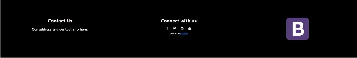
The CSS style for the footer is pretty simple, as for the rest of the page, as we can see below:
/* footer styling */
footer
{
    padding: 5% 5%;
    color: #fff;
    background-color: #000;
    font-size: 0.8em;
}
At this point, our simple page is coded using native Bootstrap components and a lightweight CSS file with less than 100 lines of code.
Where to go from here? Check out the next section for more resources.
✨ Links & Resources
Curious minds can go further with their study by accessing the resources presented below:
👉 Boostrap Basics - a comprehensive tutorial for beginners
The article presents all the basic concepts that a front end developer should know before using Boostrap full power: grid, containers, typography, colors, tables and modals.
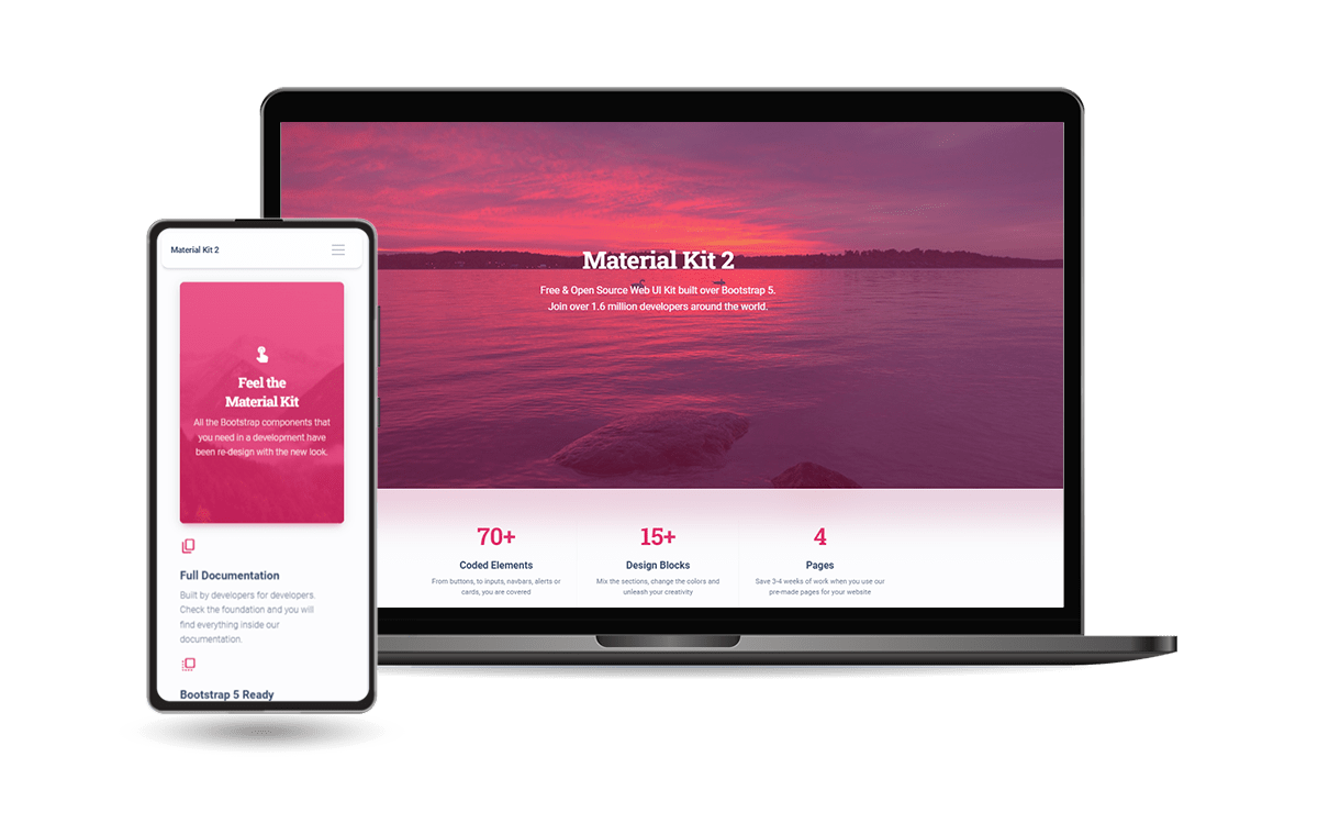
👉 Material Kit 2 - Free BS5 Design
Material Kit 2 is built with over 60 frontend individual elements, like buttons, inputs, navbars, nav tabs, cards, or alerts, giving you the freedom of choosing and combining. All components can take variations in color, which you can easily modify using SASS files and classes.
- Material Kit 2 - LIVE Demo
- Material Kit 2 - Product page
This Freebie Bootstrap 5 Design System is coming with prebuilt design blocks, so the development process is seamless, switching from our pages to the real website is very easy to be done.