Chakra UI and Next JS - Getting Started by coding a Sample
In this tutorial, you'll learn how to build a modern landing page using Next.js 12 and the Chakra UI library - Free Sample Included.


Hello! This article explains how to get started with Chakra UI and Next JS by coding a landing page with common sections like navigation, header, services, a minimal gallery, and a footer. For newcomers, Chakra is a popular library for coding user interfaces and Next JS is a full-stack framework built on top of React. Thanks for reading!
- 👉 Chakra & NextJS Tourist House - LIVE Demo
- 👉 Chakra & NextJS Tourist House - Source Code (MIT)

Why use Chakra UI
Chakra UI is a simple and modular library that enables us to build stunning and modern web applications using various UI components. It differs from other UI frameworks because all its components come with accessibility and dark mode support by default. With Chakra UI, you can create React applications quickly and easily.
Accessibility and Dark mode support
Chakra UI components have in-built dark mode support and allow you to create themes depending on your needs without downplaying accessibility. With Chakra UI, your web applications meet the Web Content Accessibility Guidelines (WCAG) 2.1 standards and are usable by users with visual, auditory, motor, or cognitive impairments.
Highly customizable components
Chakra UI allows complete customization of its components to enable you to create unique and personalized designs for your applications. You can modify, edit, and extend the Chakra UI components to fit a particular design or functionality.
Easy to integrate and use
Chakra UI is easy to use and requires little configuration. You don't have to spend much time learning how to use its web components. If you are familiar with CSS or other UI libraries like Tailwind CSS, you will pick up Chakra UI within a few minutes of reading the documentation.
Excellent documentation
Chakra UI documentation includes clear examples, code snippets, and explanations of each component's props, making it easy to understand, use and customize them. Its documentation is user-friendly to help you quickly learn how to use the components and take advantage of their various features.
Commonly used Chakra Components
Before we start building the landing page, there are some commonly used Chakra UI components you need to know.
Box - This is the same as the HTML div element. It accepts props such as background color, size, width, padding, margin, etc.
Flex - This is the same as a div element with its display set to flex. It accepts all the CSS flex attributes as props.
Spacer - It is a child element of the Flex component. It determines how spaced the flex items should be.
Icon - This allows us to add icons to our web applications. It accepts the icon as a prop and attributes such as box size, color, height, width, etc.
Heading - This is the same as the HTML h-tags.
Text - This is the same as the HTML paragraph tag.
Button - This is the same as the HTML button tag.
Setting up Chakra in NextJS
To install Chakra UI in a Next.js project, follow the steps below:
Create the Next.js project by running the code below.
$ npx create-next-app@12 chakra-ui-projectRun the code below to install Chakra UI and its dependencies.
$ yarn add @chakra-ui/react @emotion/react @emotion/styled framer-motionWrap the entire app with the ChakraProvider component to enable us to use the Chakra UI components.
import "../styles/globals.css";
import { ChakraProvider } from "@chakra-ui/react";


function MyApp({ Component, pageProps }) {
   return (
       <ChakraProvider>
           <Component {...pageProps} />
       </ChakraProvider>
   );
}

export default MyApp;
Since there are icons on the web page, install the Chakra UI icon and the React Icons libraries.
$ yarn add @chakra-ui/icons react-iconsHow to use fonts in Chakra
Here, you'll learn how to use Google fonts in a Chakra UI project. Visit the Google font webpage for Montserrat, the one used in this project.
Add all the font variants and copy the link for the font.
Next, create a pages/_document.js file and copy the code below into the file. The _document.js file can update the HTML and BODY tags of a Next.js web page.
import { Html, Head, Main, NextScript } from "next/document";


export default function Document() {
   return (
       <Html>
           <Head>
               <link rel='preconnect' href='https://fonts.googleapis.com' />
               <link
                   rel='preconnect'
                   href='https://fonts.gstatic.com'
                   crossOrigin='true'
               />
               <link
                   href='https://fonts.googleapis.com/css2?family=Montserrat:wght@100;200;300;400;500;600;700;800;900&display=swap'
                   rel='stylesheet'
               />
           </Head>
           <body>
               <Main />
               <NextScript />
           </body>
       </Html>
   );
}
Update the _app.js to add the Montserrat font to Chakra UI.
import "../styles/globals.css";
import { ChakraProvider } from "@chakra-ui/react";
import { extendTheme } from "@chakra-ui/react";


const theme = extendTheme({
   fonts: {
       heading: `'Montserrat', sans-serif`,
       body: `'Montserrat', sans-serif`,
   },
});


function MyApp({ Component, pageProps }) {
   return (
       <ChakraProvider theme={theme}>
           <Component {...pageProps} />
       </ChakraProvider>
   );
}

export default MyApp;
The extendTheme function allows us to edit and extend the default UI styles provided by Chakra UI.
Finally, copy the CSS code here into the styles/globals.css file. It contains all the CSS required for styling this project.
Coding the Header component
Before we start designing each web component, create a components folder containing App.js, Header.js, Main.js, and Footer.js files.
mkdir components
cd components
touch App.js Header.js Main.js Footer.js
From the code snippet above:
- The App.js component will contain all the web page components.
- The Header.js, Main.js, and Footer.js components will hold the header, the main, and the footer elements respectively.
Update the pages/index.js component as done below.
import Head from "next/head";
import App from "../components/App";
import { Box } from "@chakra-ui/react";

export default function Home() {
   return (
       <Box w='full'>
           <Head>
               <title>Tourist Mountain</title>
               <meta name='description' content='Generated by create next app' />
               <link rel='icon' href='/favicon.ico' />
           </Head>


           <App />
       </Box>
   );
}
Copy the code below into the components/App.js file.
import React from "react";
import { Box } from "@chakra-ui/react";
import Header from "./Header";
import Main from "./Main";
import Footer from "./Footer";

const App = () => {
   return (
       <Box maxWidth='1280px'>
           <Header />
           <Main />
           <Footer />
       </Box>
   );
};

export default App;
Update the Header.js file.
import React from "react";
import Nav from "./Nav";
import Hero from "./Hero";
import { Box } from "@chakra-ui/react";

const Header = () => {
   return (
       <Box className='header'>
           <Box className='header__content'>
               <Nav />
               <Hero />
           </Box>
       </Box>
   );
};
The Header component is divided into two - Nav and Hero components. Run the code below in your terminal to create both files.
cd components
touch Nav.js Hero.js
The Nav Component
Before we begin, create a utils folder containing a utils.js file.
mkdir utils
cd utils
touch utils.js
Copy the code snippet below into the file. It represents the list of navigation links on the web page. We will map the UI through the array to display the links on the web page.
export const links = [
   {
       id: 1,
       link: "/",
       name: "Home",
   },
   { id: 2, link: "#about", name: "About" },
   {
       id: 3,
       link: "#services",
       name: "Services",
   },
   {
       id: 4,
       link: "#contact",
       name: "Contact",
   },
];
Finally, update the Nav.js file as done below.
import React from "react";
import {
   Box,
   Flex,
   HStack,
   Heading,
   Icon,
   Link,
   Spacer,
} from "@chakra-ui/react";
import { GrFacebookOption, GrInstagram } from "react-icons/gr";
import { links } from "../utils/utils";

const Nav = () => {
   return (
       <Flex
           w='full'
           alignItems='center'
           minHeight={"10vh"}
           padding={{ base: "30px", md: "30px 70px" }}
           justifyContent='space-between'
       >
           <Box>
               <Heading as='h2' size='md' color='#fff'>
                   HOUSE
               </Heading>
           </Box>

           <Spacer />

           <HStack spacing='30px' display={{ base: "none", lg: "inline-block" }}>
               {links.map((li) => (
                   <Link
                       href={li.link}
                       color='#fff'
                       opacity={0.7}
                       fontWeight='semibold'
                       key={li.id}
                   >
                       {li.name}
                   </Link>
               ))}
           </HStack>

           <Spacer />

           <HStack spacing='30px'>
               <Icon as={GrFacebookOption} color='#fff' boxSize={6} />
               <Icon as={GrInstagram} color='#fff' boxSize={6} />
           </HStack>
       </Flex>
   );
};

export default Nav;
The HStack component enables us to display its child elements side by side, and the spacing prop adds uniform spacing between them.
Coding the Main component
Copy the code snippet below into the Main.js file.
import services from "../images/services.png";
import { Box } from "@chakra-ui/react";
import Services from "./Services";
import Gallery from "./Gallery";
import Image from "next/image";
import React from "react";

const Main = () => {
   return (
       <Box
           w='full'
           bg='#13182C'
           padding={{ base: " 50px", md: "50px", lg: "100px 70px" }}
           position='relative'
       >
           <Box position='absolute' top='1px' left='0px'>
               <Image src={services} alt='Services' />
           </Box>
           <Services />
           <Gallery />
       </Box>
   );
};

export default Main;
The code snippet above renders the Services and Gallery components. We'll create them in the upcoming sections. The Image Component displays the background text.
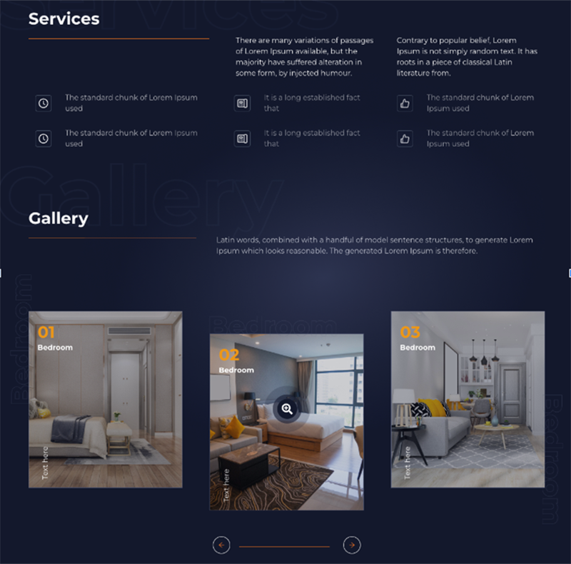
The Services Component
Run the code below to create the Services.js file within the components folder.
cd components
touch Services.js
Copy the code below into the Services.js file.
import { Flex, Heading, Spacer, Box, Text } from "@chakra-ui/react";
import React from "react";
import { IconText } from "../utils/utils";

const ServicesText = ({ content }) => (
   <Box
       w={{ base: "100%", lg: "30%" }}
       px={{ base: 0, lg: 15 }}
       mt={{ base: 5, lg: 0 }}
   >
       <Text color='#F5F5F5'>{content}</Text>
   </Box>
);

const Services = () => {
   return (
       <Box w='full'>
           <Heading as='h2' color='#FFFFFF' pb='15px' id='services'>
               Services
           </Heading>
           <Flex
               w='full'
               alignItems='flex-start'
               marginBottom={30}
               direction={{ base: "column", lg: "row" }}
           >
               <Box className='line full' width={{ base: "100%", lg: "35%" }} />
               <Spacer />


               <ServicesText
                   content='There are many variations of passages of Lorem Ipsum available, but
                       the majority have suffered alteration in some form, by injected
                       humour.'
               />

               <Spacer />
               <ServicesText
                   content='Contrary to popular belief, Lorem Ipsum is not simply random text.
                       It has roots in a piece of classical Latin literature from.'
               />
           </Flex>

           <IconText />
           <IconText />
       </Box>
   );
};

export default Services;
From the code snippet above:
- The ServicesText component renders the subheading contents.
- I imported the IconText component from the utils file.
Next, create the IconText within the utils.js file. Copy the code below into the utils/utils.js file.
import { Flex, Spacer, Box, Text, Icon } from "@chakra-ui/react";
import { AiOutlineClockCircle, AiOutlineLike } from "react-icons/ai";
import { TbDeviceLandlinePhone } from "react-icons/tb";

export const IconText = () => (
   <Flex
       w='full'
       alignItems='flex-start'
       marginBottom={30}
       justifyContent='space-between'
       direction={{ base: "column", md: "row" }}
   >
       <TextItem
           first
           icon={AiOutlineClockCircle}
           text='The standard chunk of Lorem Ipsum used'
       />
       <Spacer />
       <TextItem
           icon={TbDeviceLandlinePhone}
           text='It is a long established fact that'
       />
       <Spacer />
       <TextItem
           icon={AiOutlineLike}
           text='The standard chunk of Lorem Ipsum used'
       />
   </Flex>
);

const TextItem = ({ first, icon, text }) => (
   <Flex
       w={{ base: "100%", md: first ? "37%" : "30%" }}
       px={{ base: 0, md: 15 }}
       alignItems='center'
       marginBottom={{ base: 5, md: 0 }}
   >
       <Flex
           padding='5px'
           border='1px'
           borderColor='gray.600'
           alignItems='center'
           justifyContent='center'
           borderRadius='5px'
           marginRight='30px'
       >
           <Icon as={icon} color='#fff' boxSize={6} />
       </Flex>
       <Box>
           <Text color='#f5f5f5' opacity={0.7}>
               {text}
           </Text>
       </Box>
   </Flex>
);
The code snippet above renders the icon and text for each row. The TextItem component displays an icon and its text, and the IconText component displays a row of three TextItem components.
Footer Component
The Footer component is divided into two sections - the section with call-to-action and the other with the bottom navigation and endnotes.

Copy the code below into the Footer.js file.
import { Box, Flex, Heading, Text, Button } from "@chakra-ui/react";
import React from "react";
import Nav from "./Nav";

const Footer = () => {
   return (
       <Box w='full'>
           <Box
               className='footerImg'
               borderTop='1px'
               borderBottom='1px'
               borderColor='gray.600'
               id='contact'
           >
               <Flex
                   className='footer__container'
                   alignItems='center'
                   textAlign='center'
                   justifyContent='center'
                   flexDirection='column'
                   padding={70}
               >
                   <Heading as='h2' size='lg' color='#f5f5f5' marginBottom={5}>
                       Contrary to popular belief,
                   </Heading>


                   <Heading as='h2' size='lg' color='#f5f5f5' marginBottom={5}>
                       Lorem Ipsum
                   </Heading>
                   <Box className='line' width={150} marginBottom={5} />
                   <Text color='#f5f5f5' marginBottom={5}>
                       Fact that a reader will be distracted by the readable
                   </Text>
                   <Button
                       colorScheme='yellow'
                       bg='#ED9716'
                       color='#fff'
                       size='lg'
                       borderRadius='full'
                       width={200}
                   >
                       Button
                   </Button>
               </Flex>
           </Box>
           {/*--- bottom navigation ---*/}
           <Box className='footerBottom' w='full'></Box>
       </Box>
   );
};

export default Footer;
Congratulations! At this point, You've completed coding the landing page.
Conclusions
- What Chakra UI is
- Why you should use Chakra UI,
- A few Chakra UI components and how they work, and
- How to build a modern landing page using Chakra UI
Chakra UI is a great UI library for designing web applications. If you want to build web applications with a good user experience and spend less time writing codes, Chakra UI is an excellent choice.
Resources
The above sample is perfect for a simple, landing page project or eLearning activities but sometimes our project might need more than this. The next section provides a few open-source templates and starters styled with Charka coded by professionals:
React Node Purity Dashboard
This open-source full-stack starter comes with JWT Authentication, Docker, and a simple NodeJS API backend. The UI is built with over 70 frontend individual elements, like buttons, inputs, navbars, nav tabs, cards, or alerts, giving you the freedom of choosing and combining.
- 👉 React Purity Dashboard - product page
- 👉 React Purity Dashboard - LIVE Demo

Purity UI Dashboard template
Designed for those who like modern UI elements and beautiful websites. Made of hundred of elements, designed blocks and fully coded pages, Purity UI Dashboard is ready to help you create stunning websites and web apps.
- 👉 Purity Chakra Template - LIVE Demo
- 👉 Purity Chakra Template - Product Page